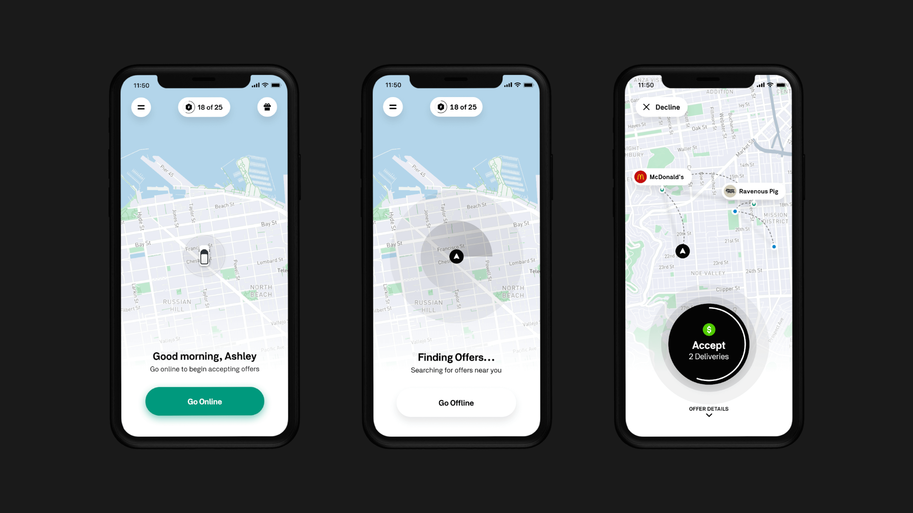
Postmates Fleet
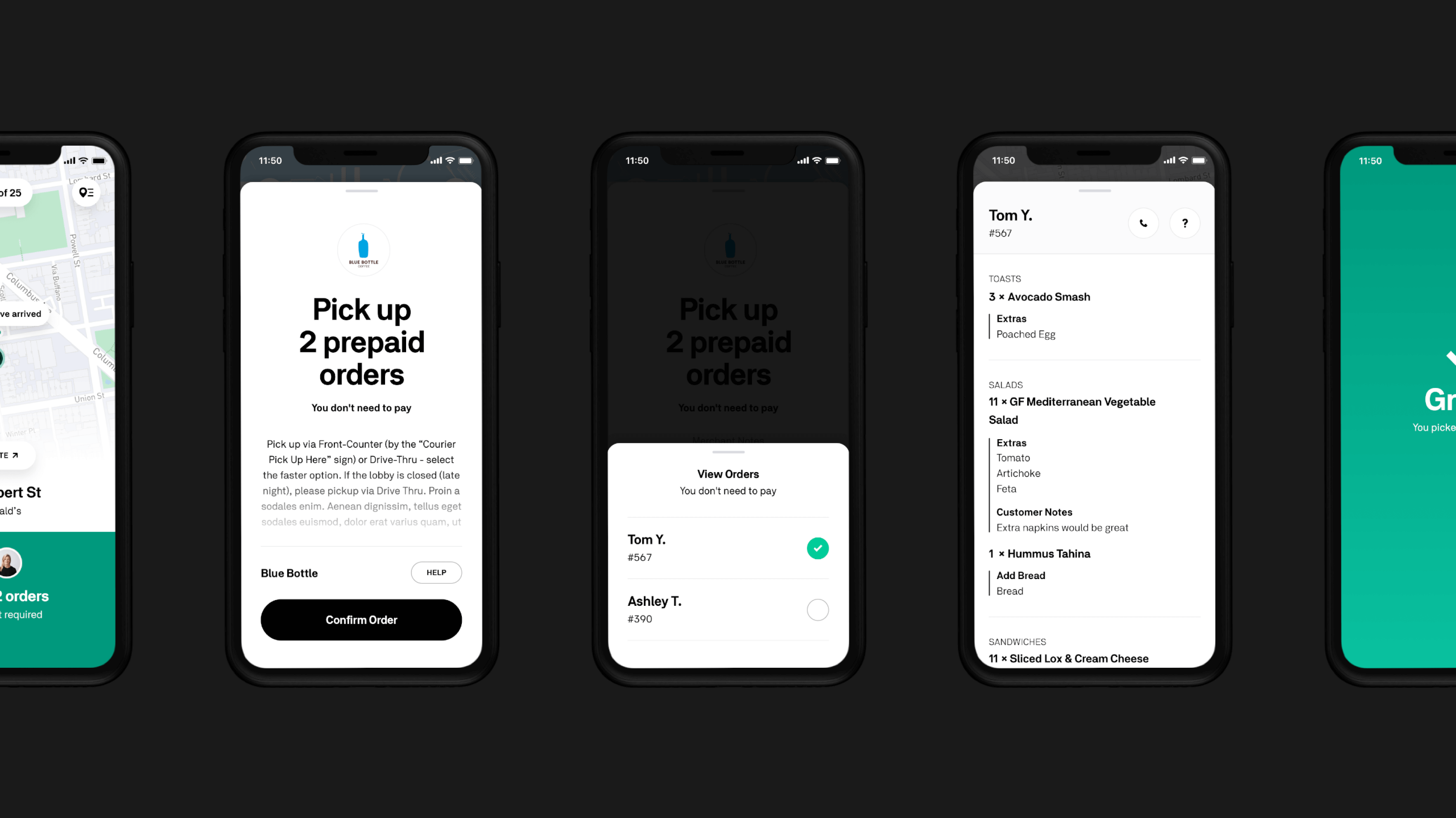
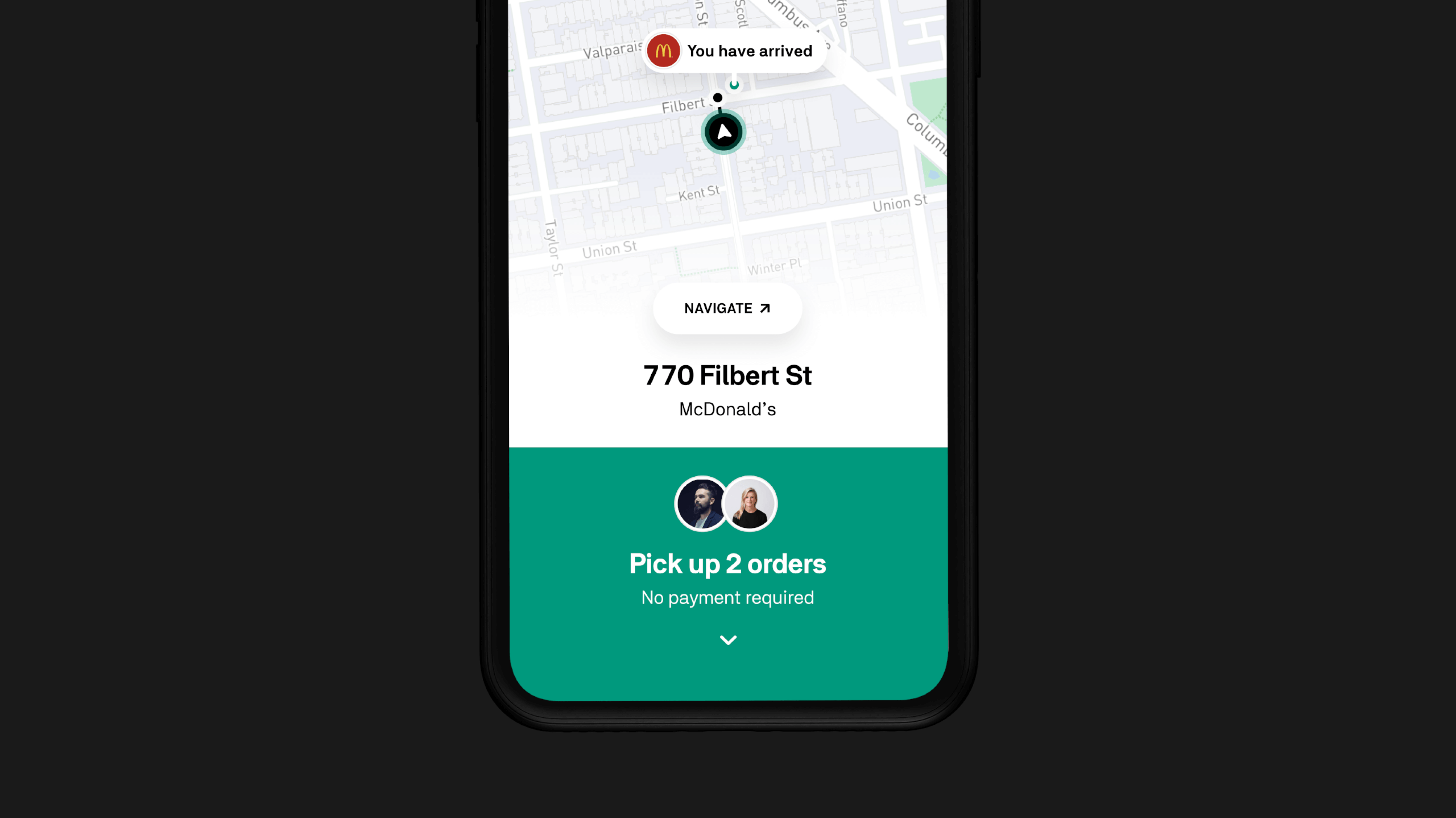
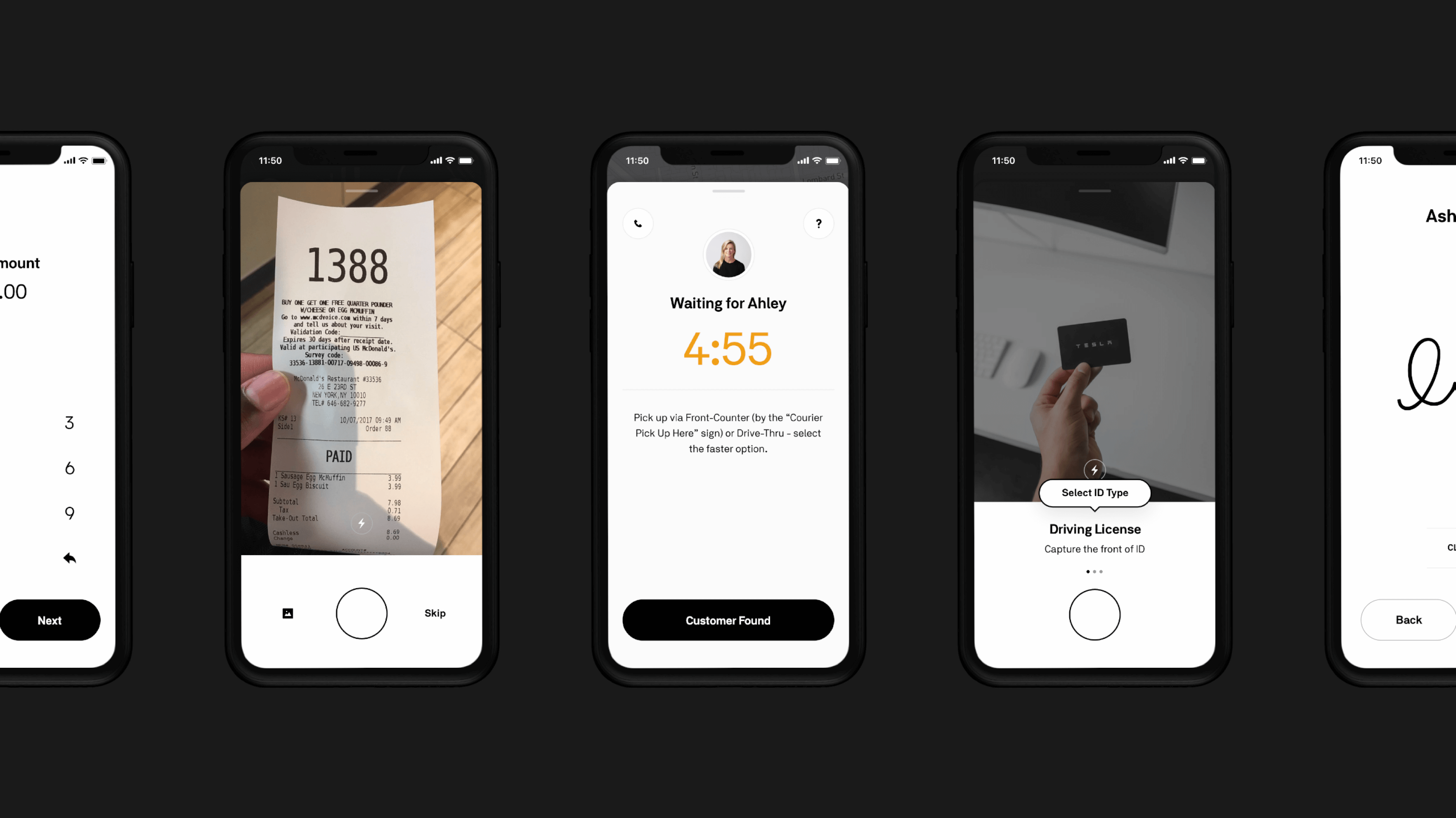
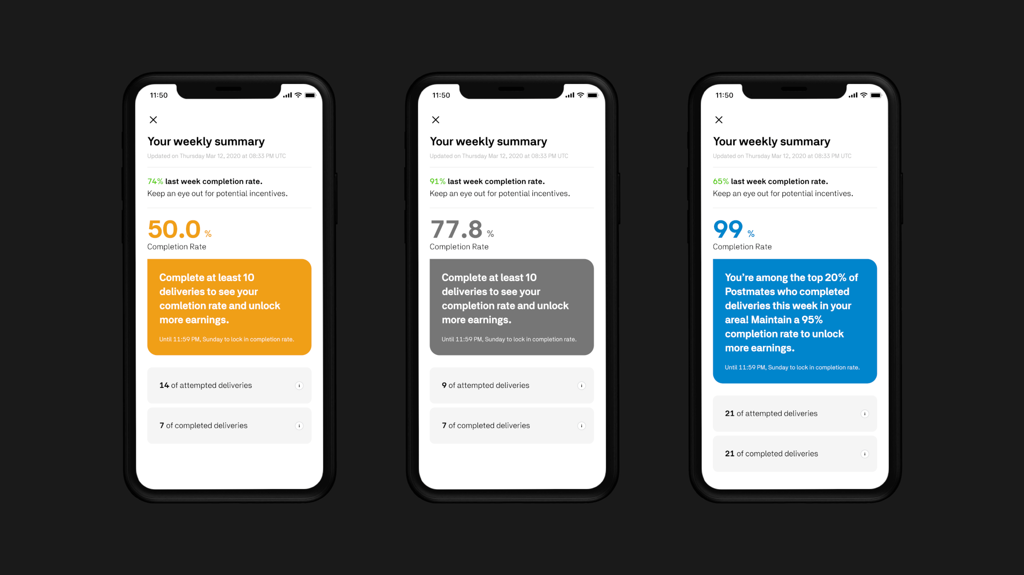
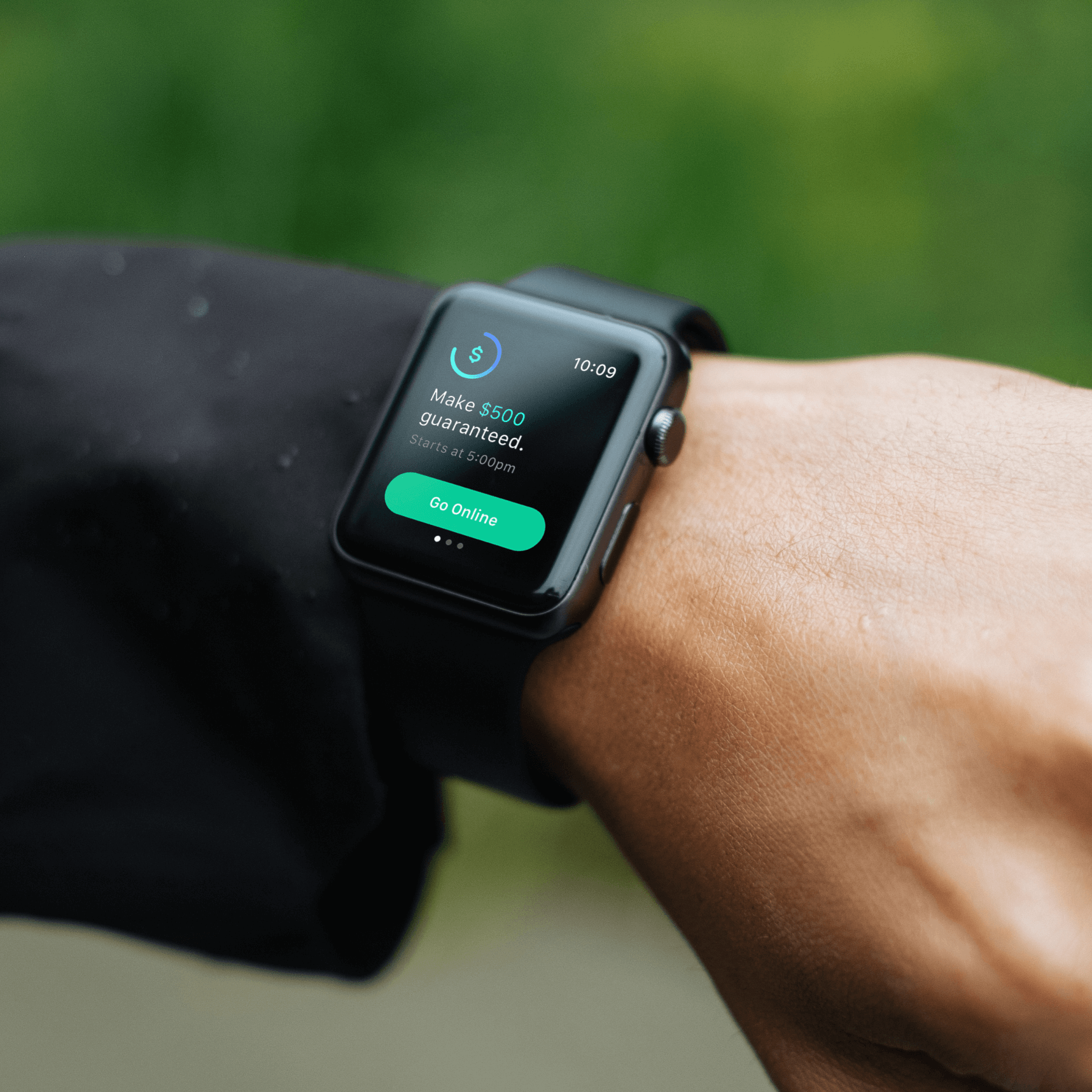
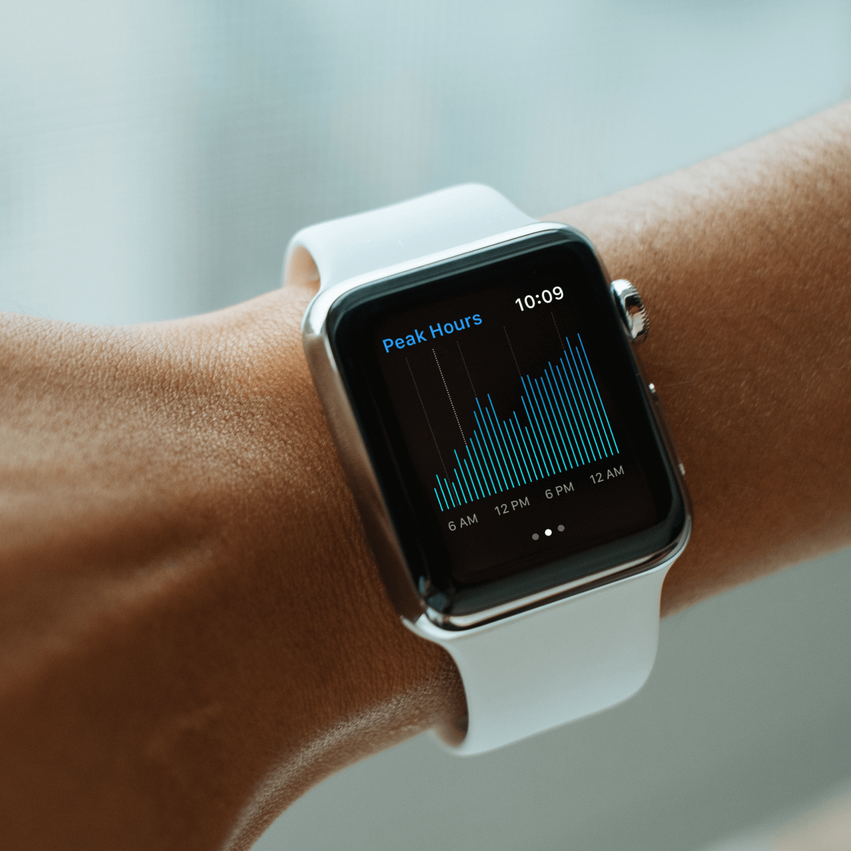
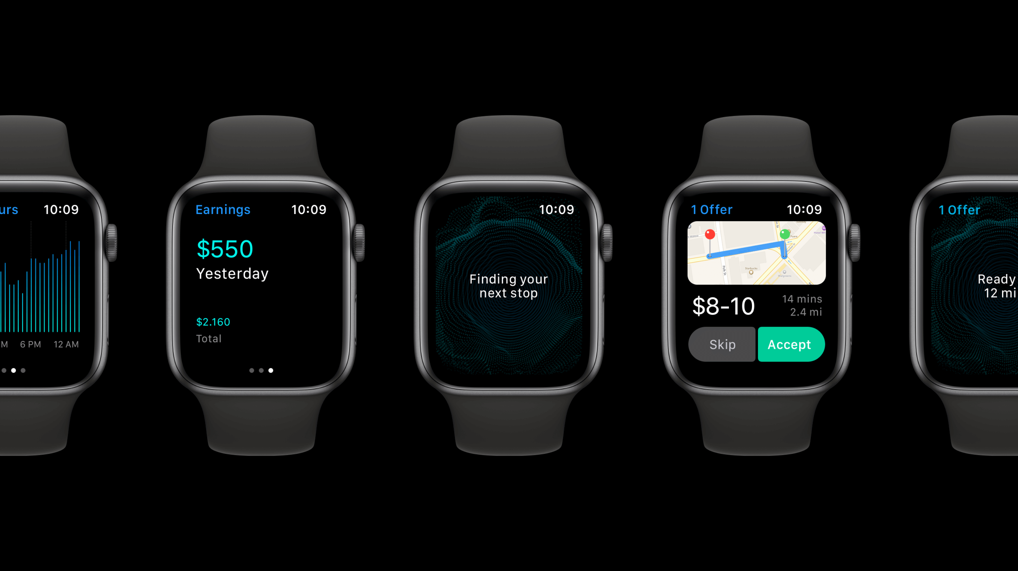
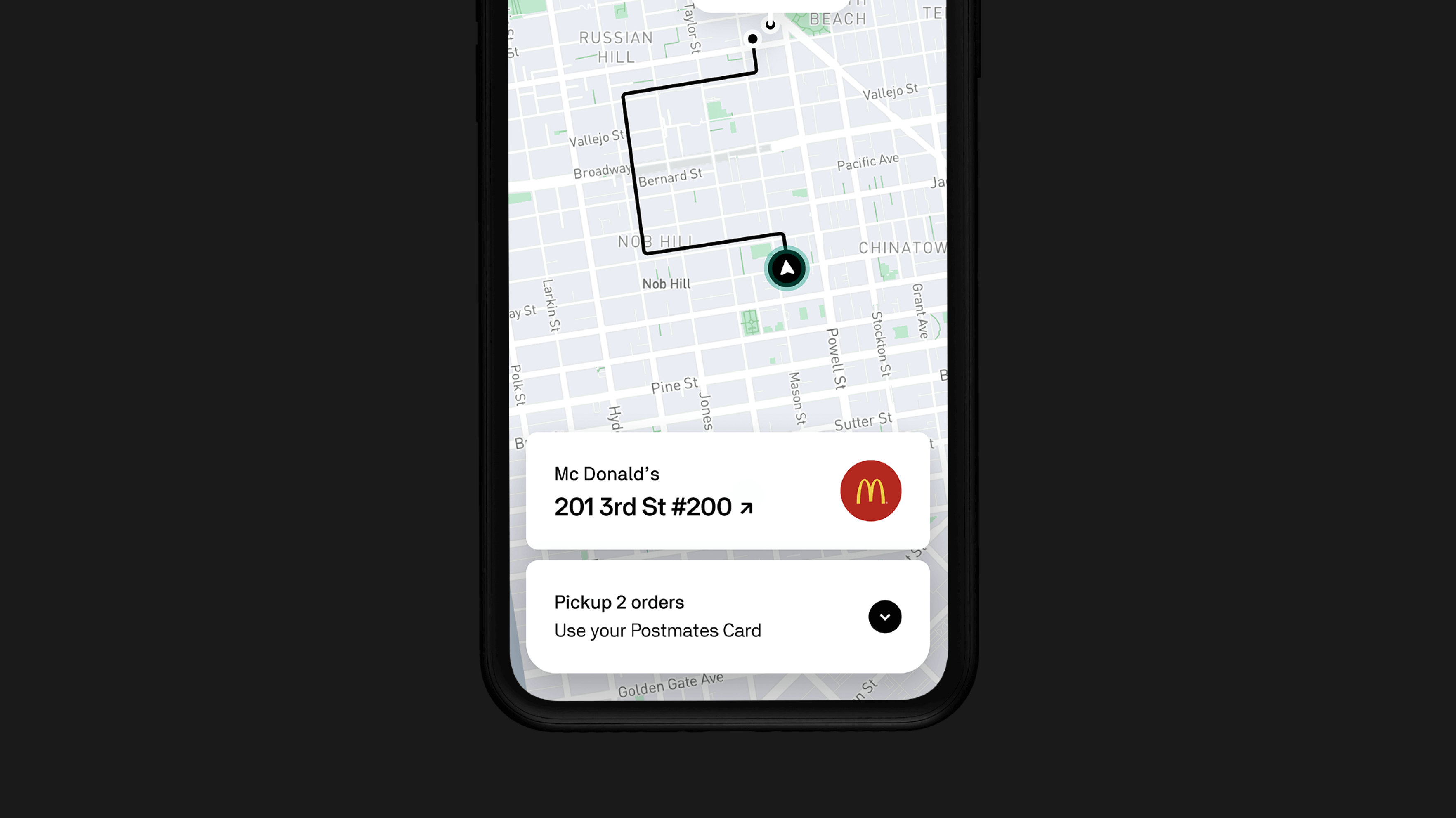
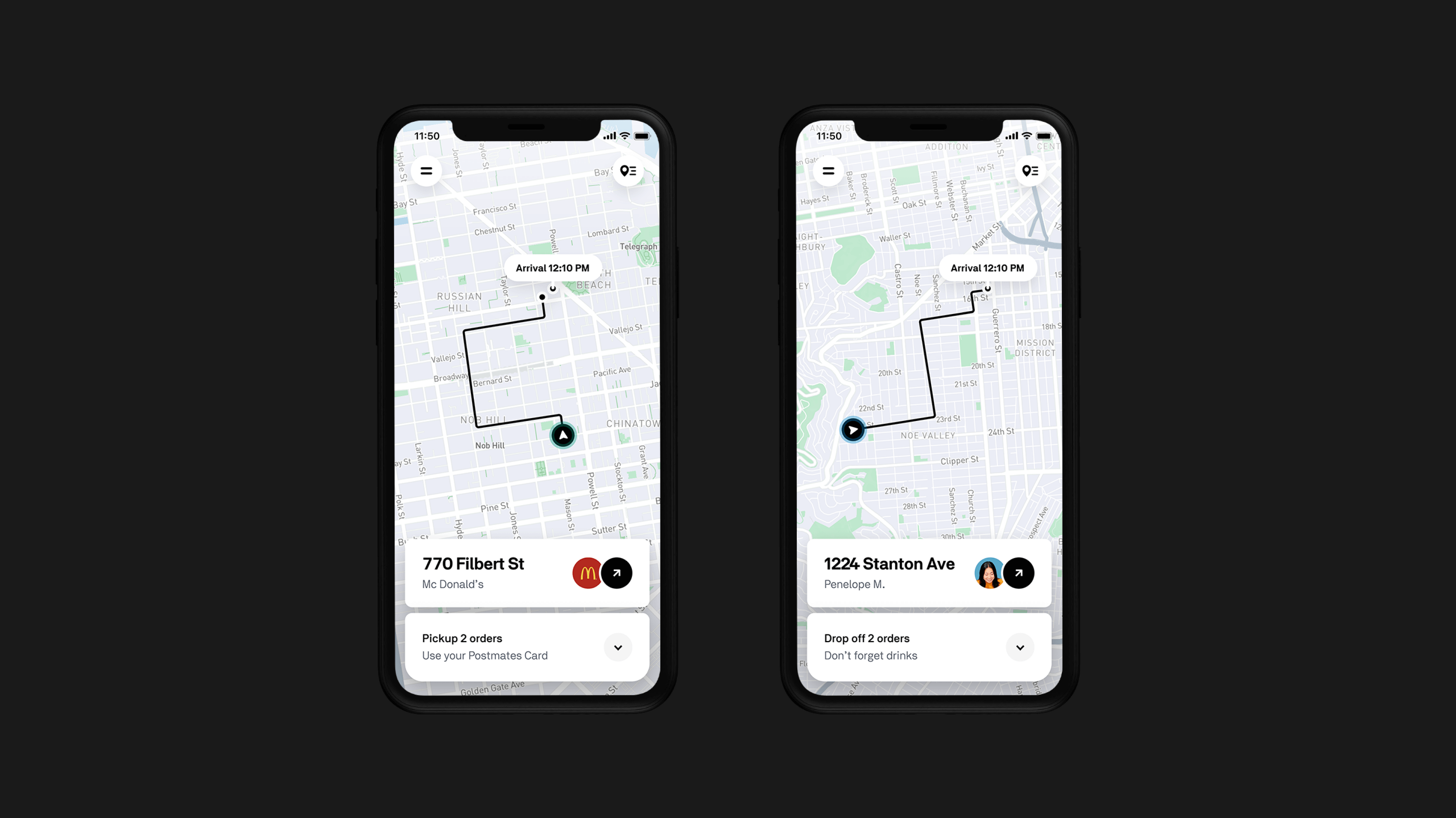
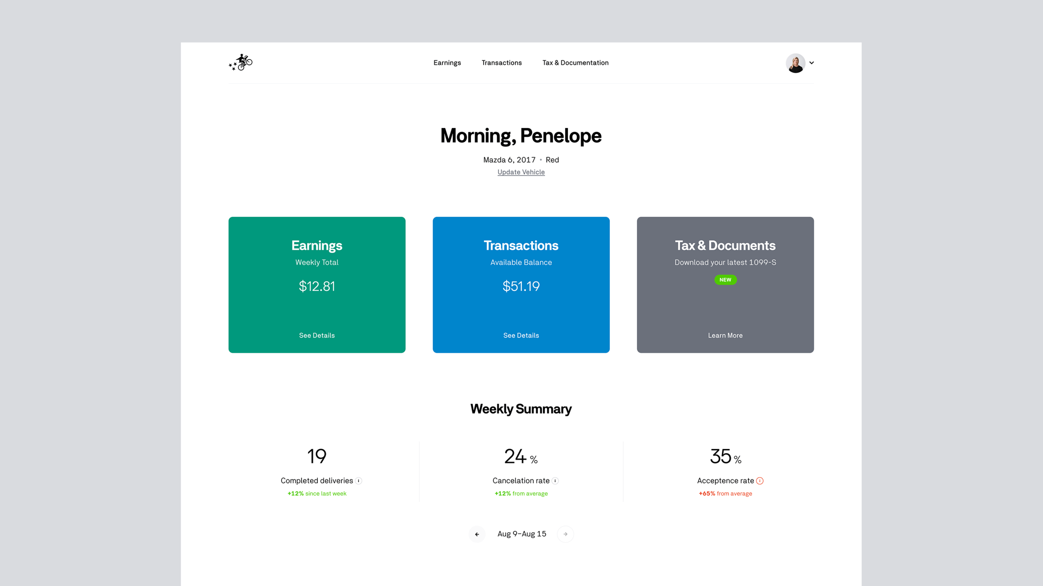
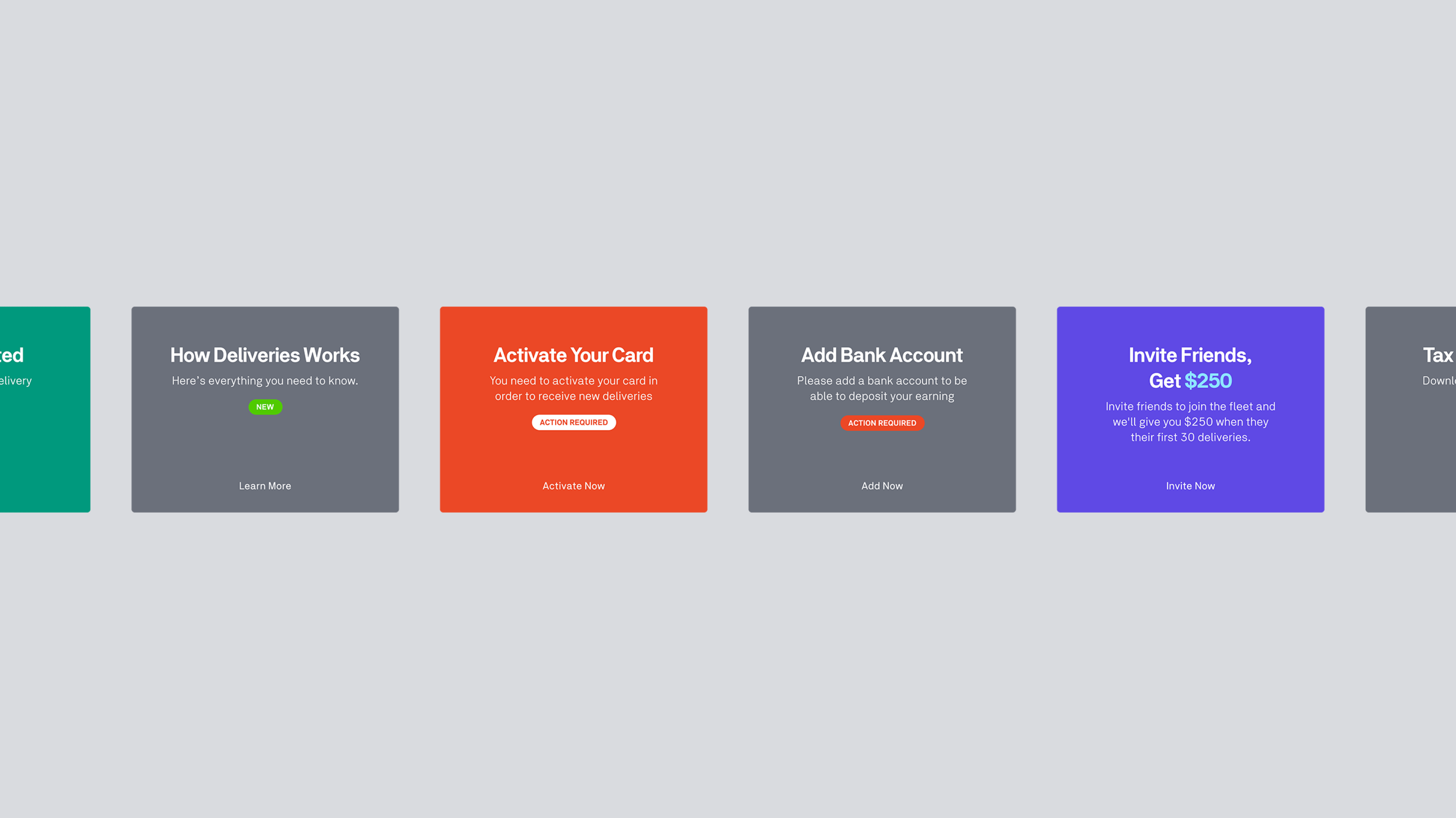
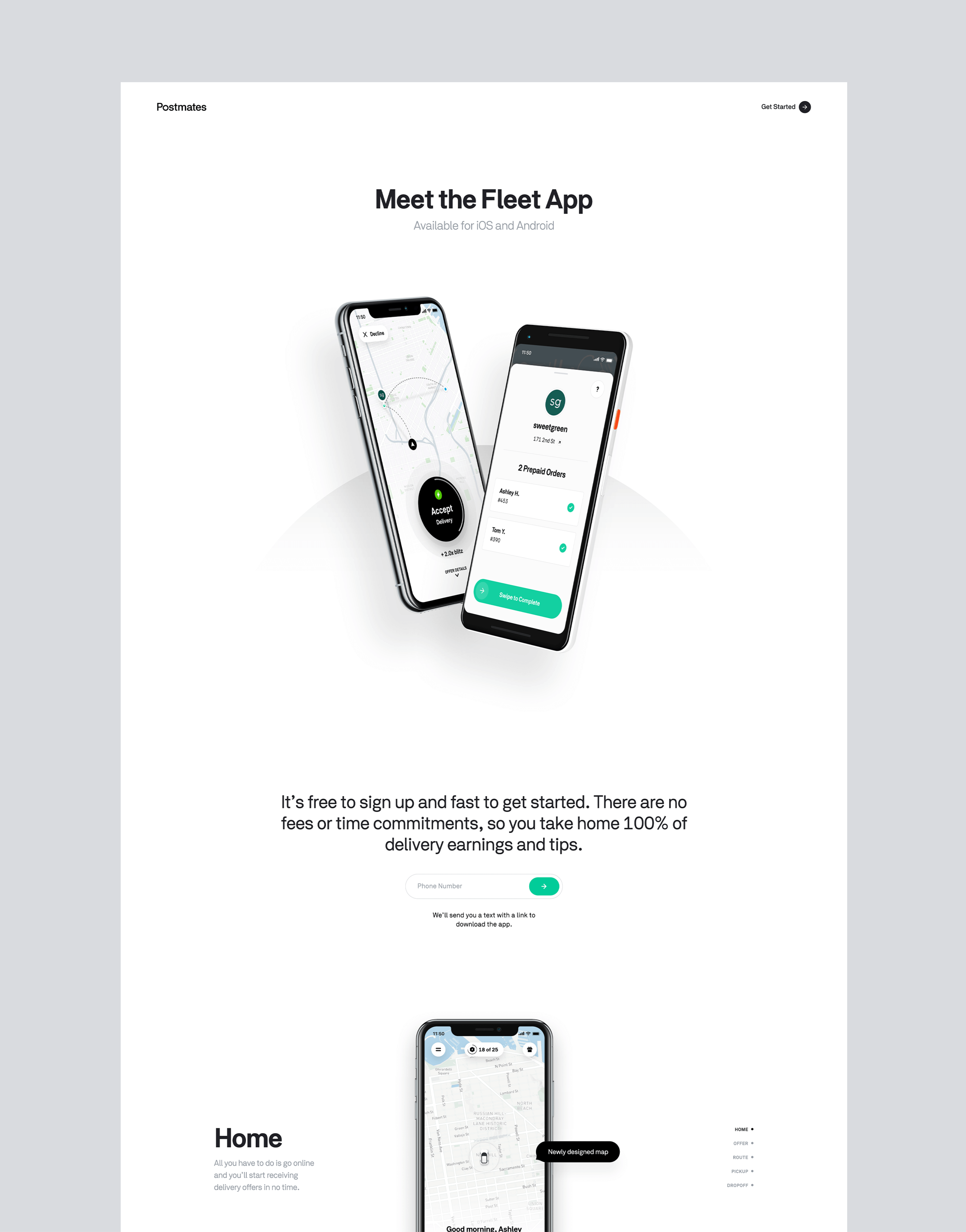
A comprehensive redesign effort for the courier app—Postmates Fleet. The goal was to build a scalable design system for future implementations and give a modern look & feel to the app. The user problems were particularly tough in a world of edge cases, both for online and offline experiences. We build contextualized flows for different delivery scenarios to provide all the essential information at the right time. After several testings and iterations, this is the final look of the app.
- Creative Director & Design Lead

Postmates Photography
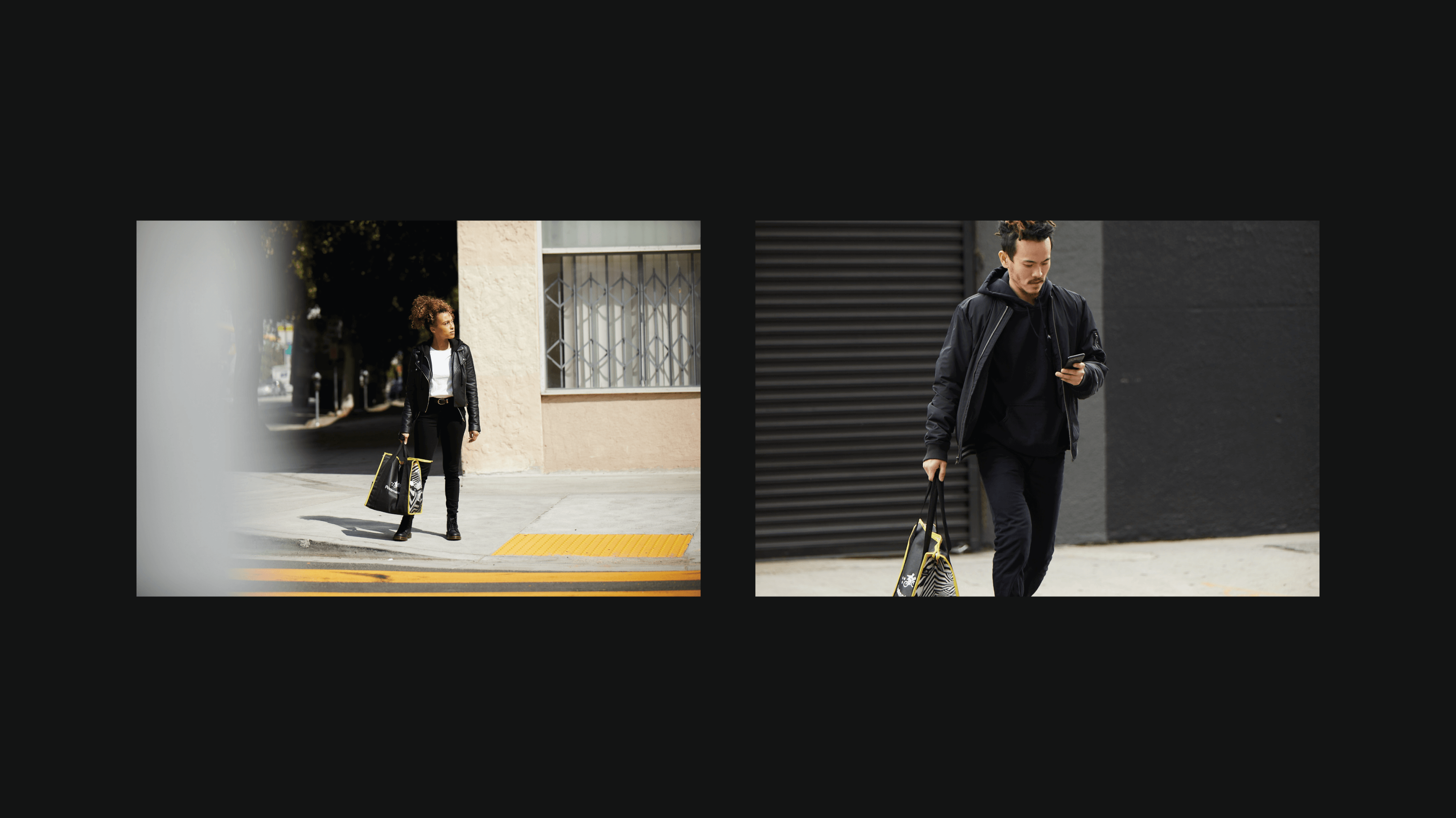
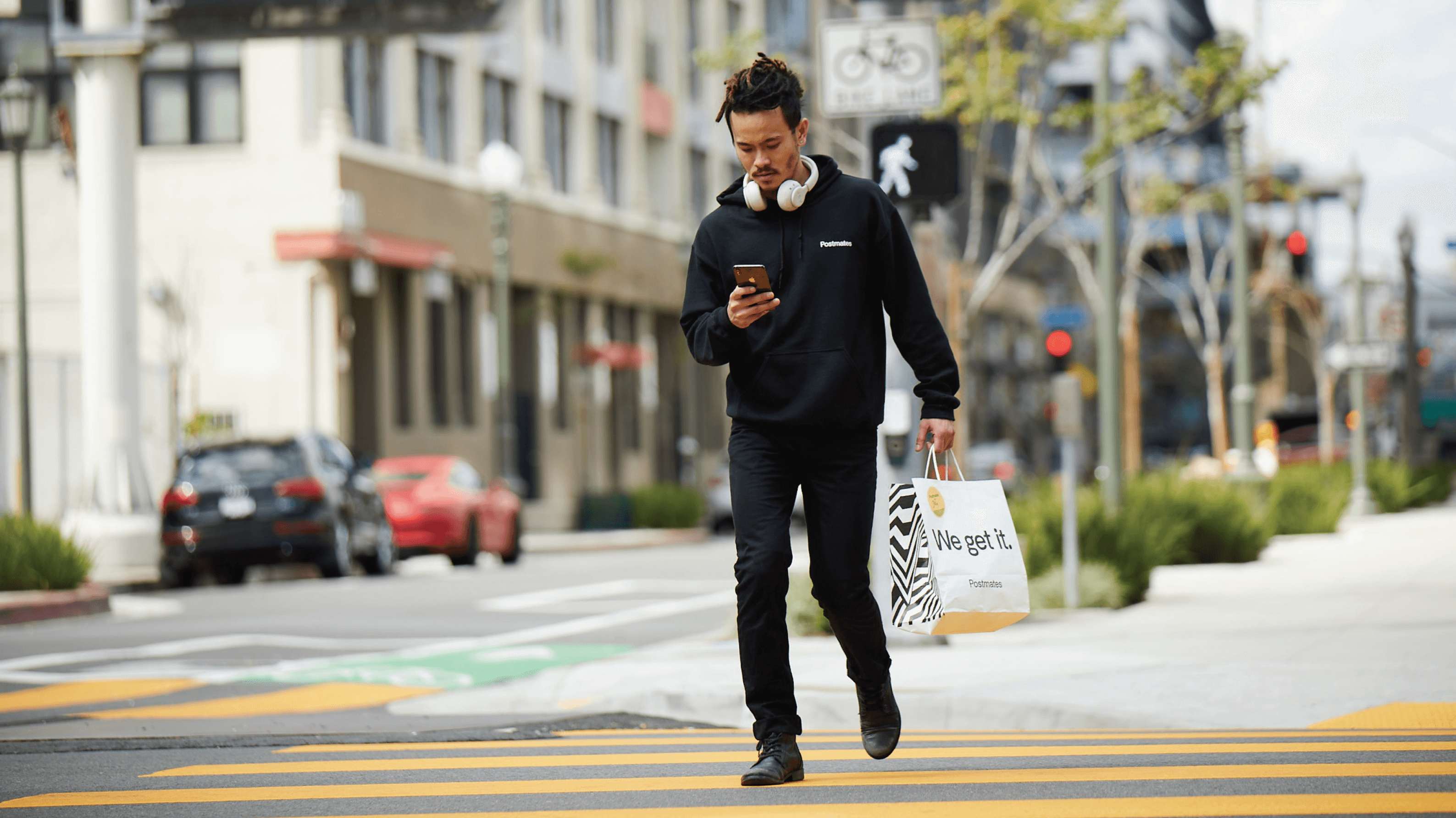
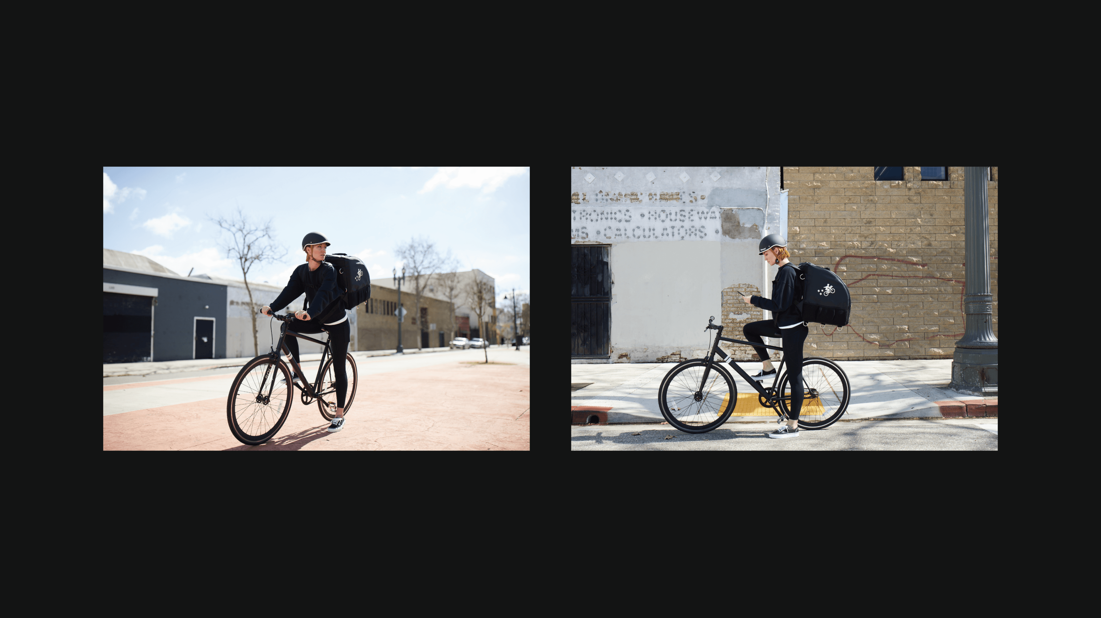
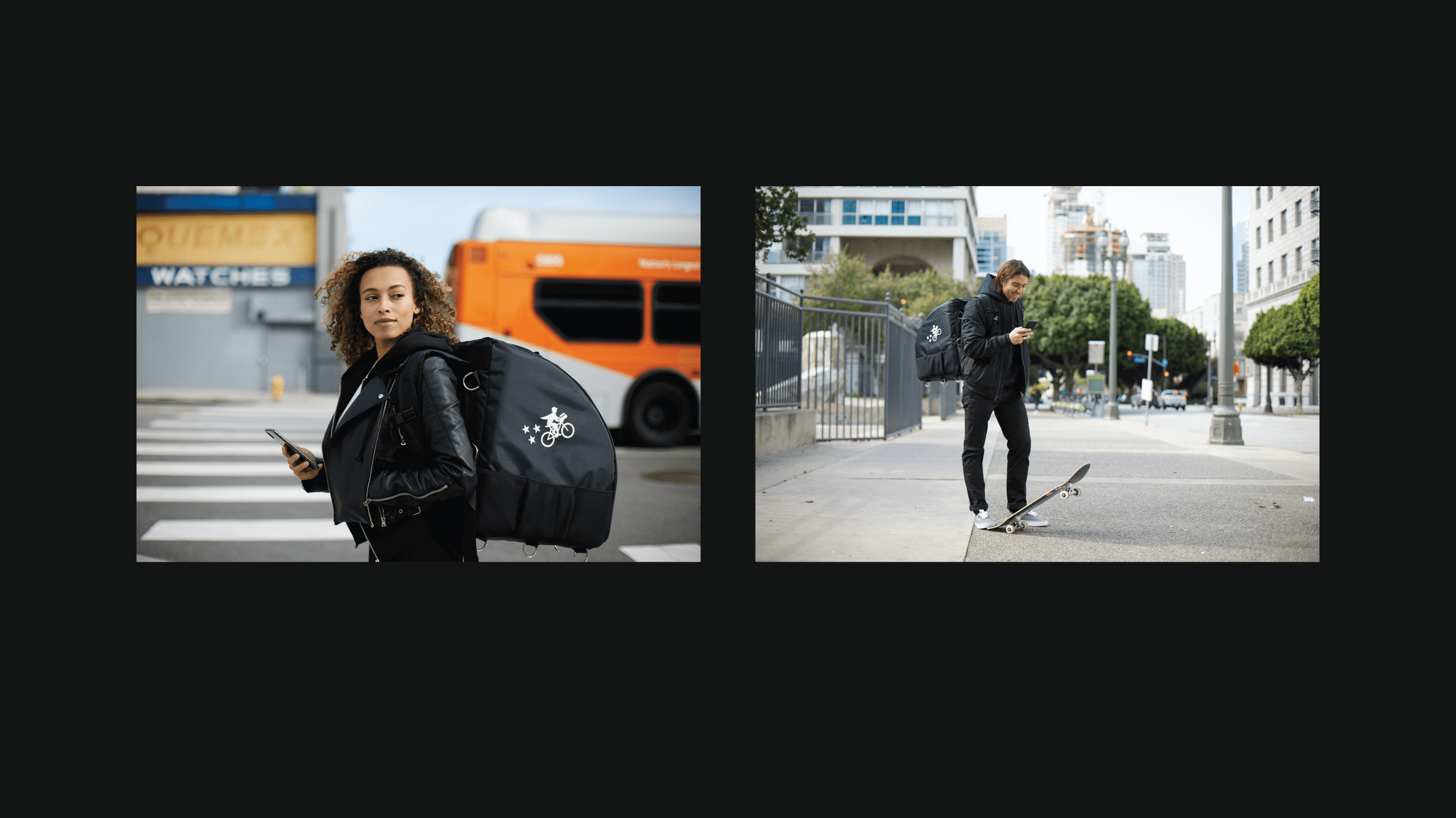
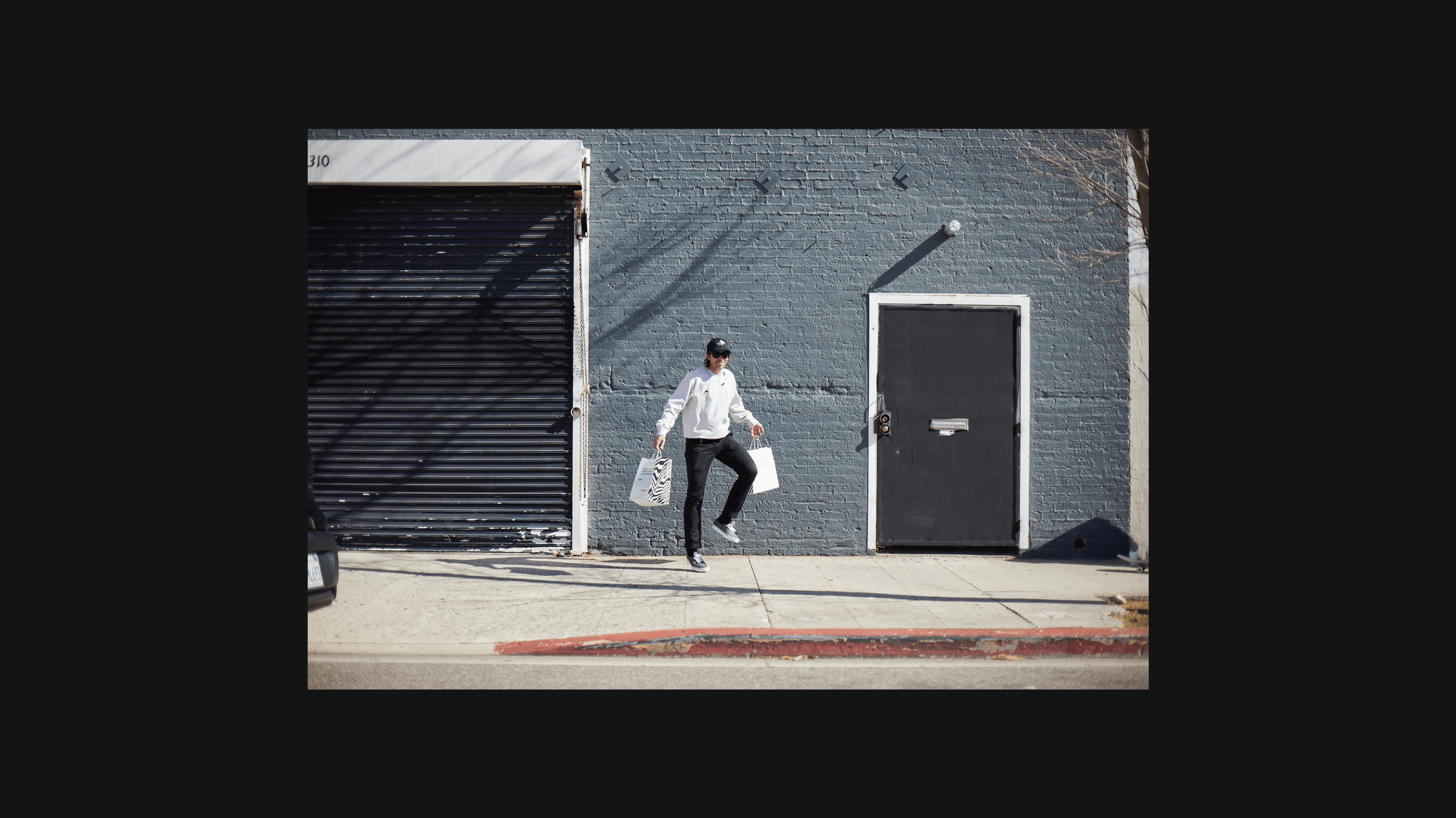
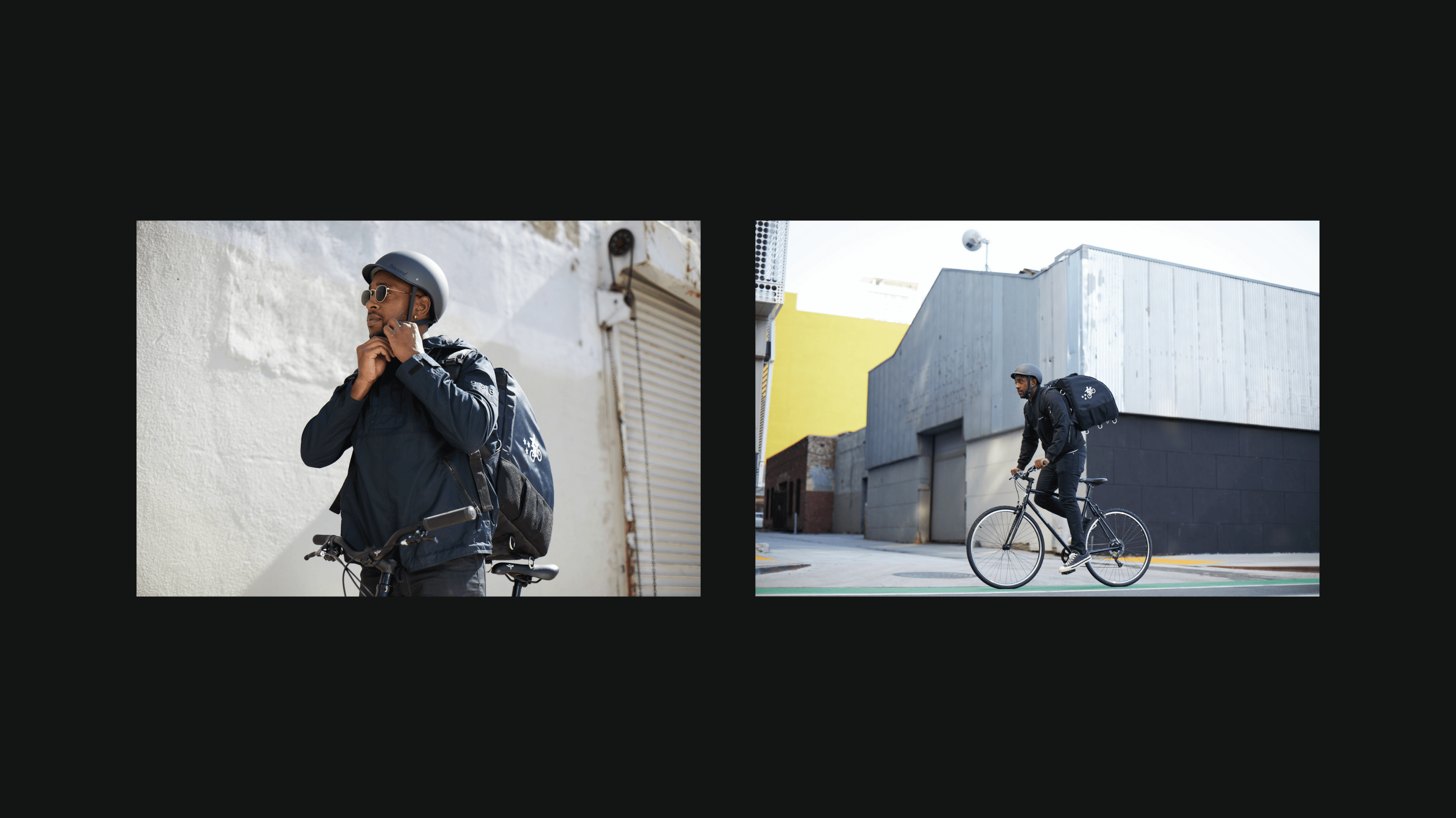
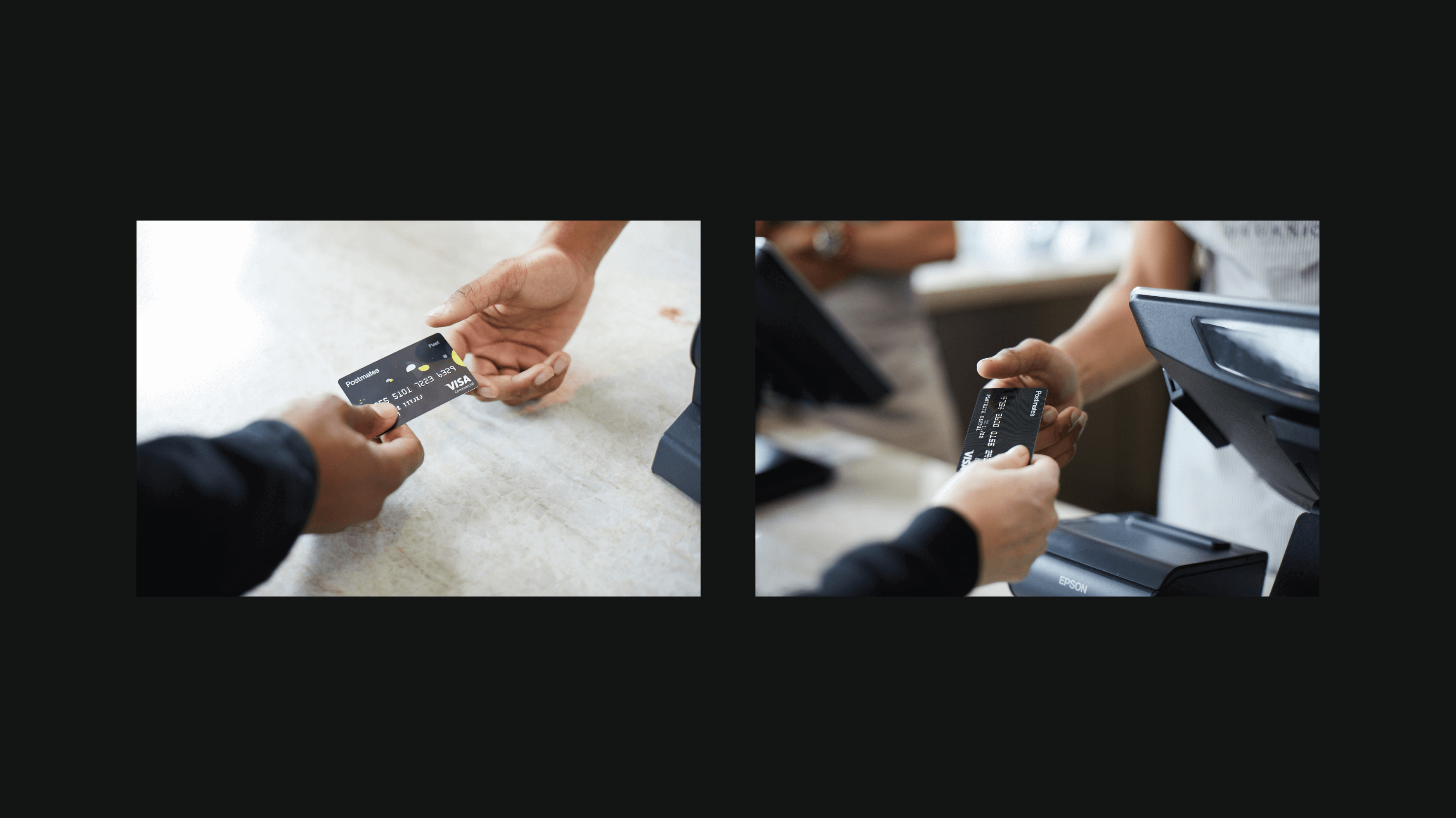
A photo gallery reflecting a Postmates' life during delivery is used as marketing materials such as emails, websites, apps, and press. After some back and forth on the overall concept and direction with the brand team, I led a team of producers, photographers, and stylists to complete a gallery of photos in various locations of Los Angeles with six different models and vehicles.
- Creative Director


Fleet V2
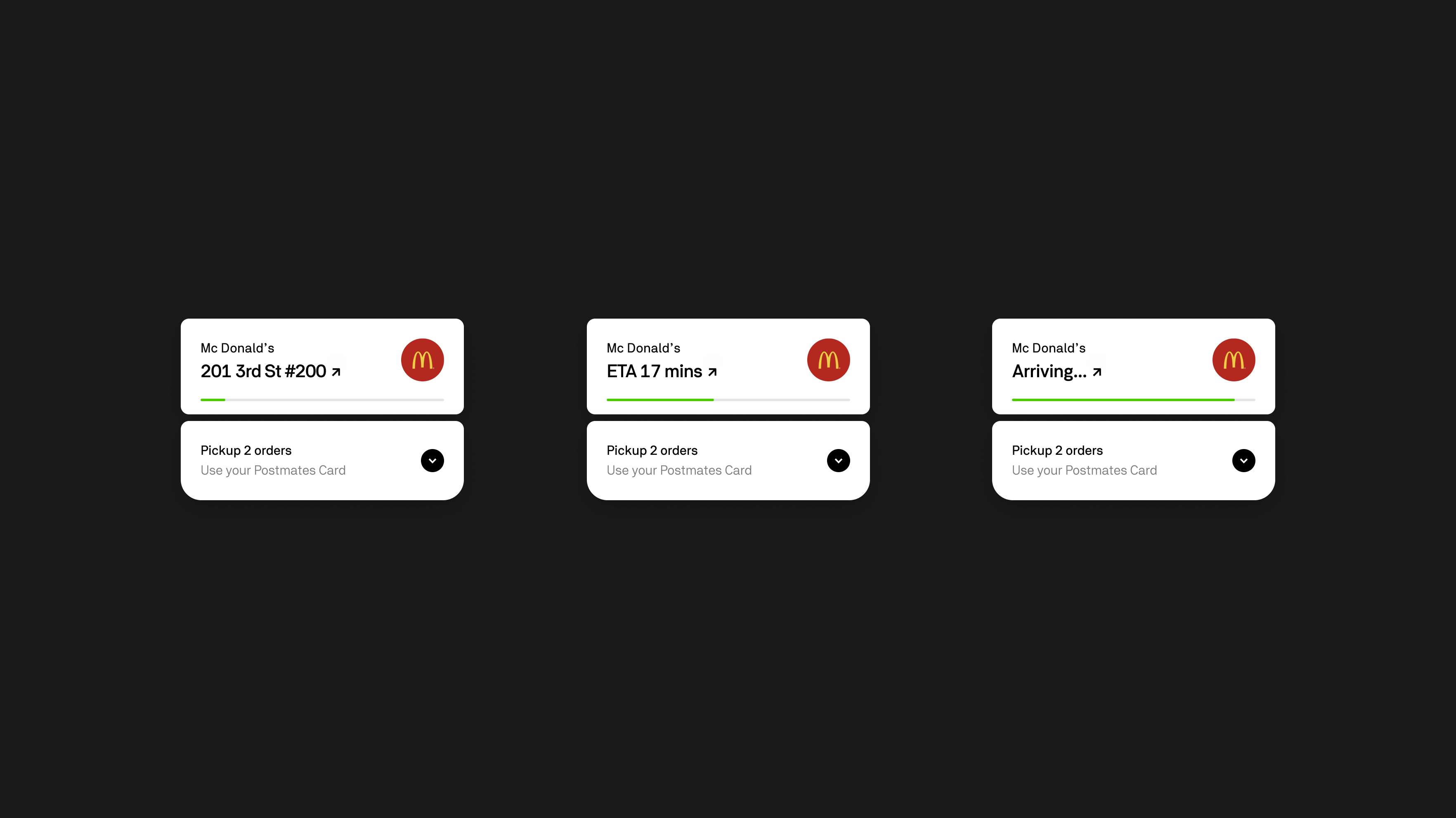
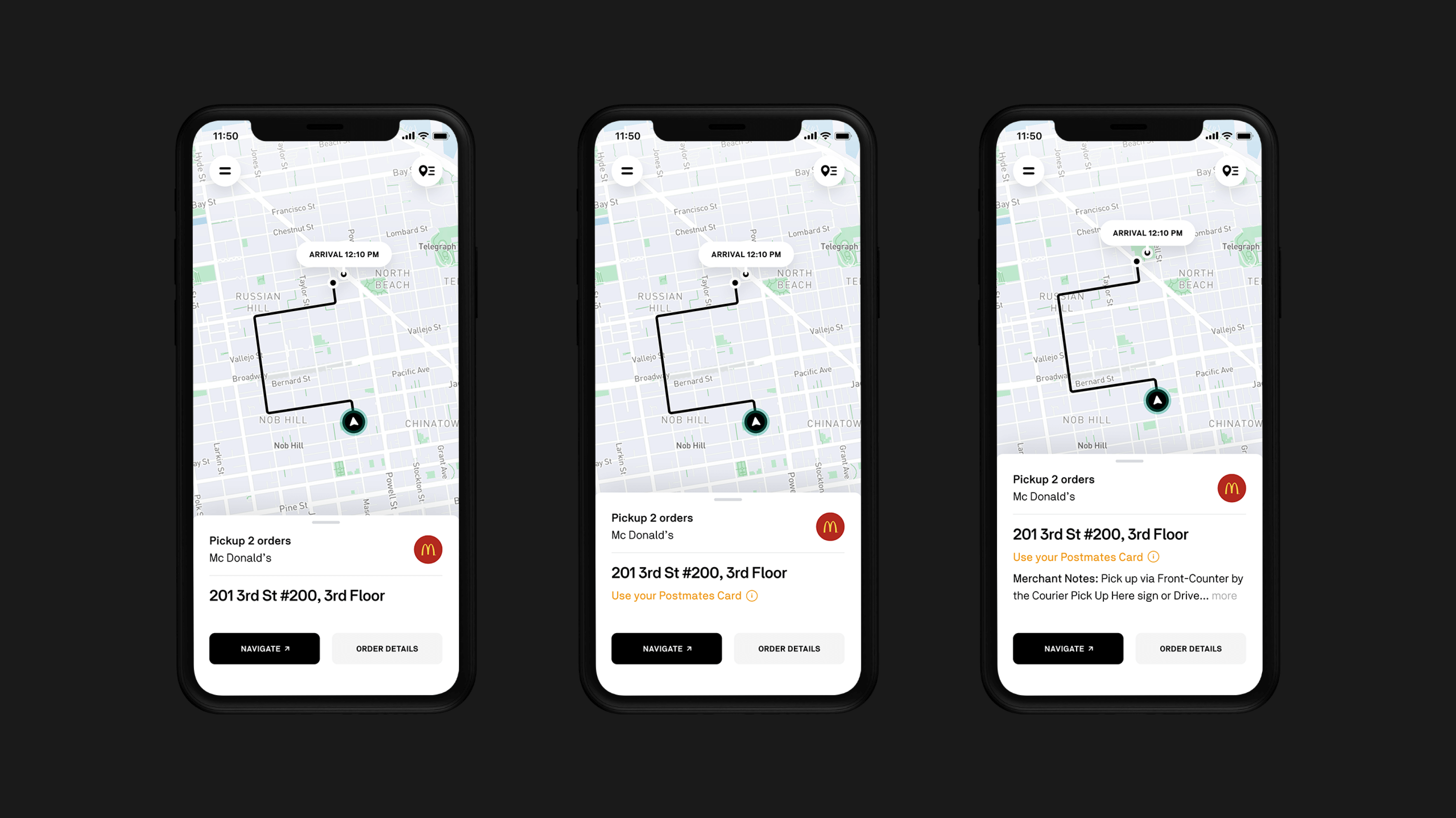
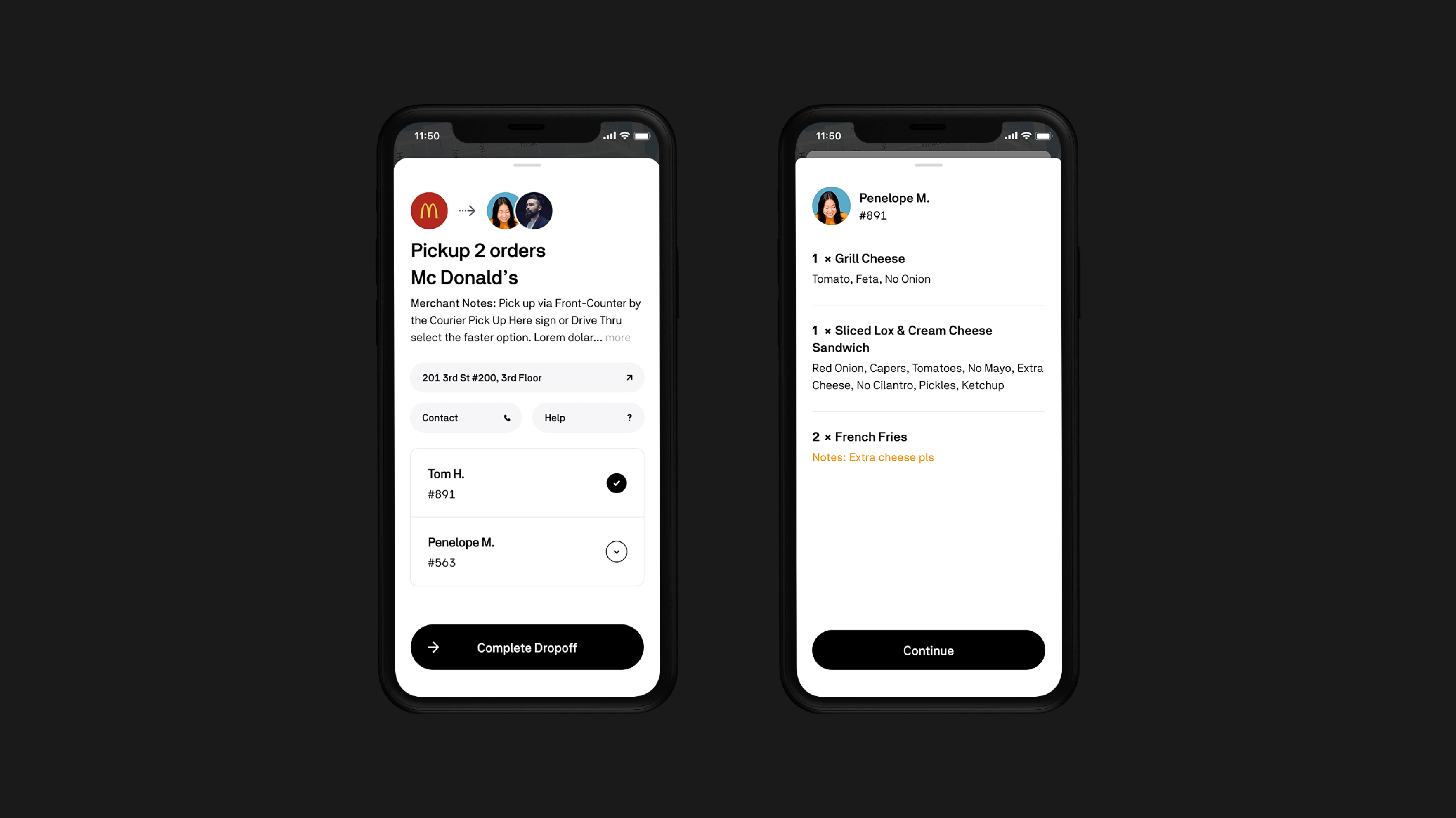
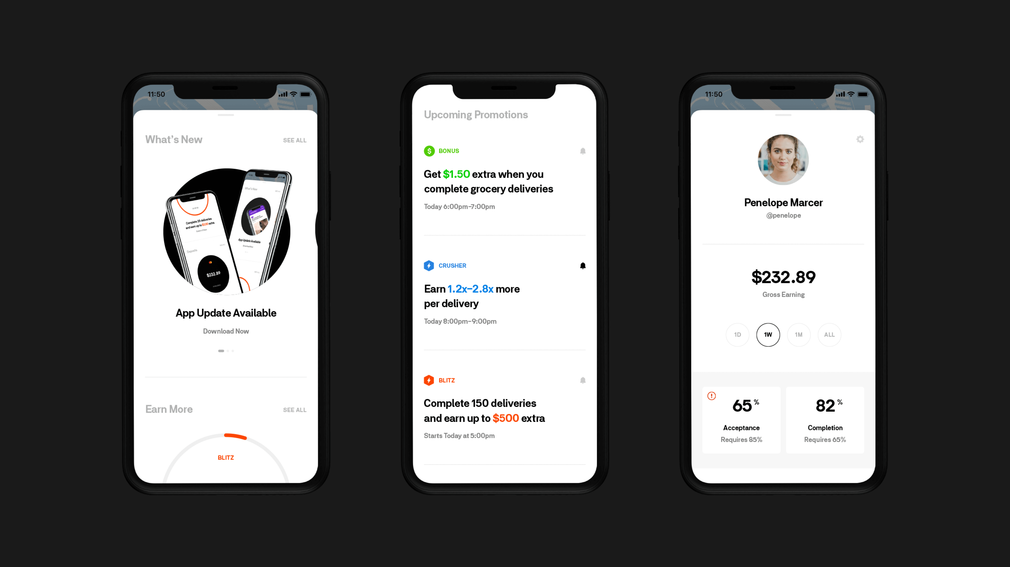
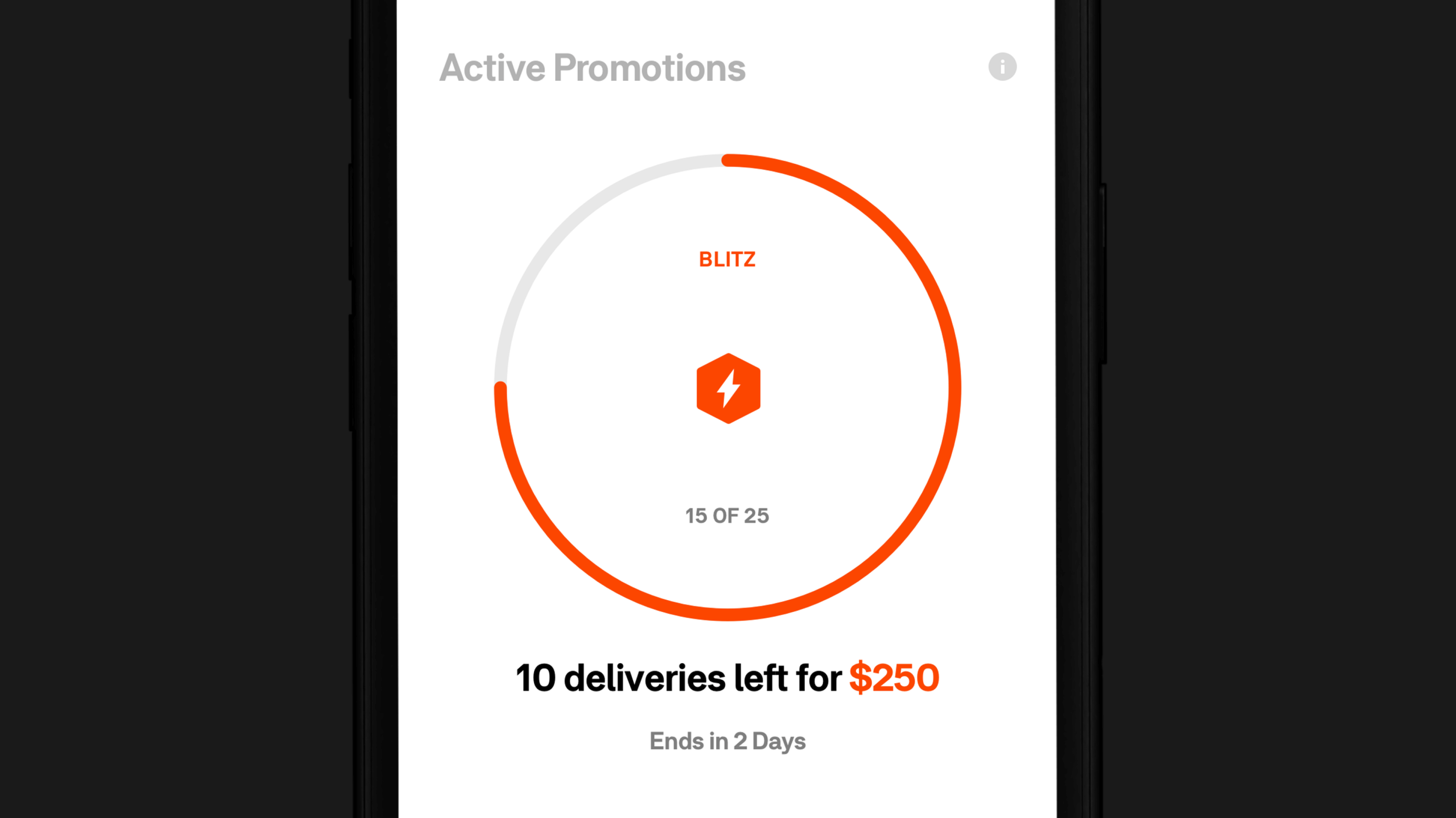
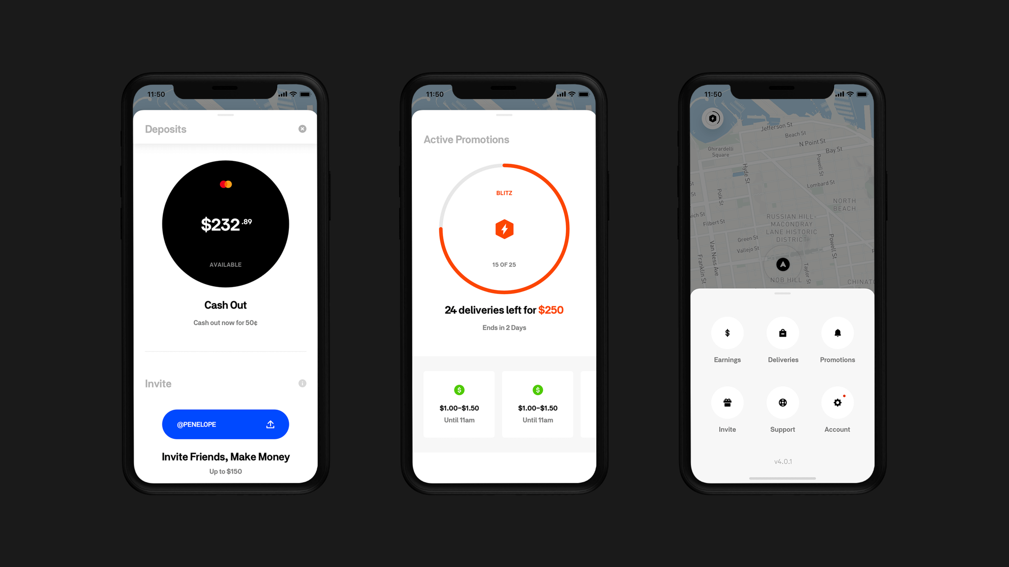
During my time at Postmates, I continuously explored and iterated our visual language by optimizing the information architecture and improving the user experience. We used bits and pieces from these screens, but the main goal of these iterations was to implement them slowly by testing and transforming the overall experience.
- Design Lead
Postmates x Square
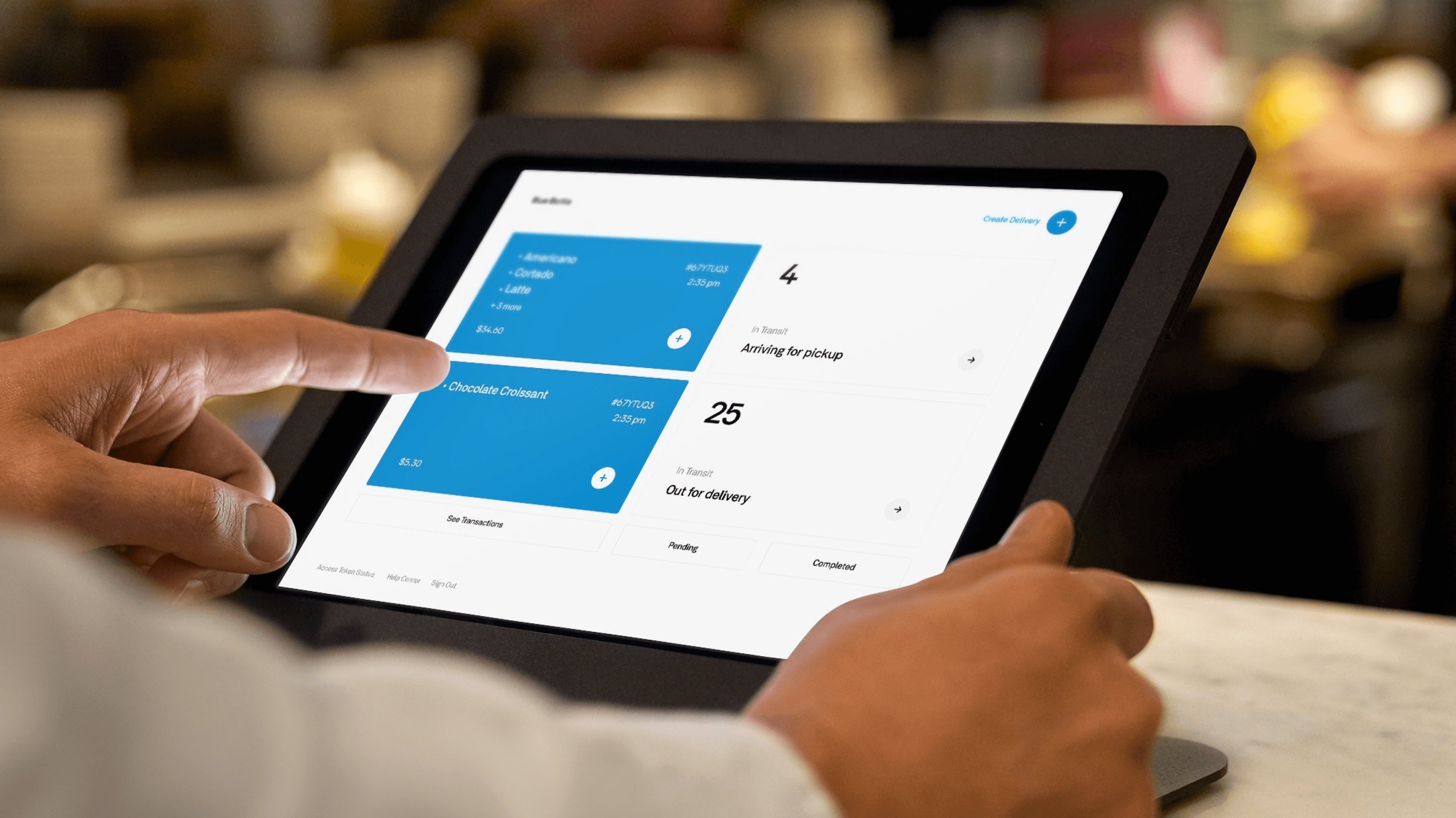
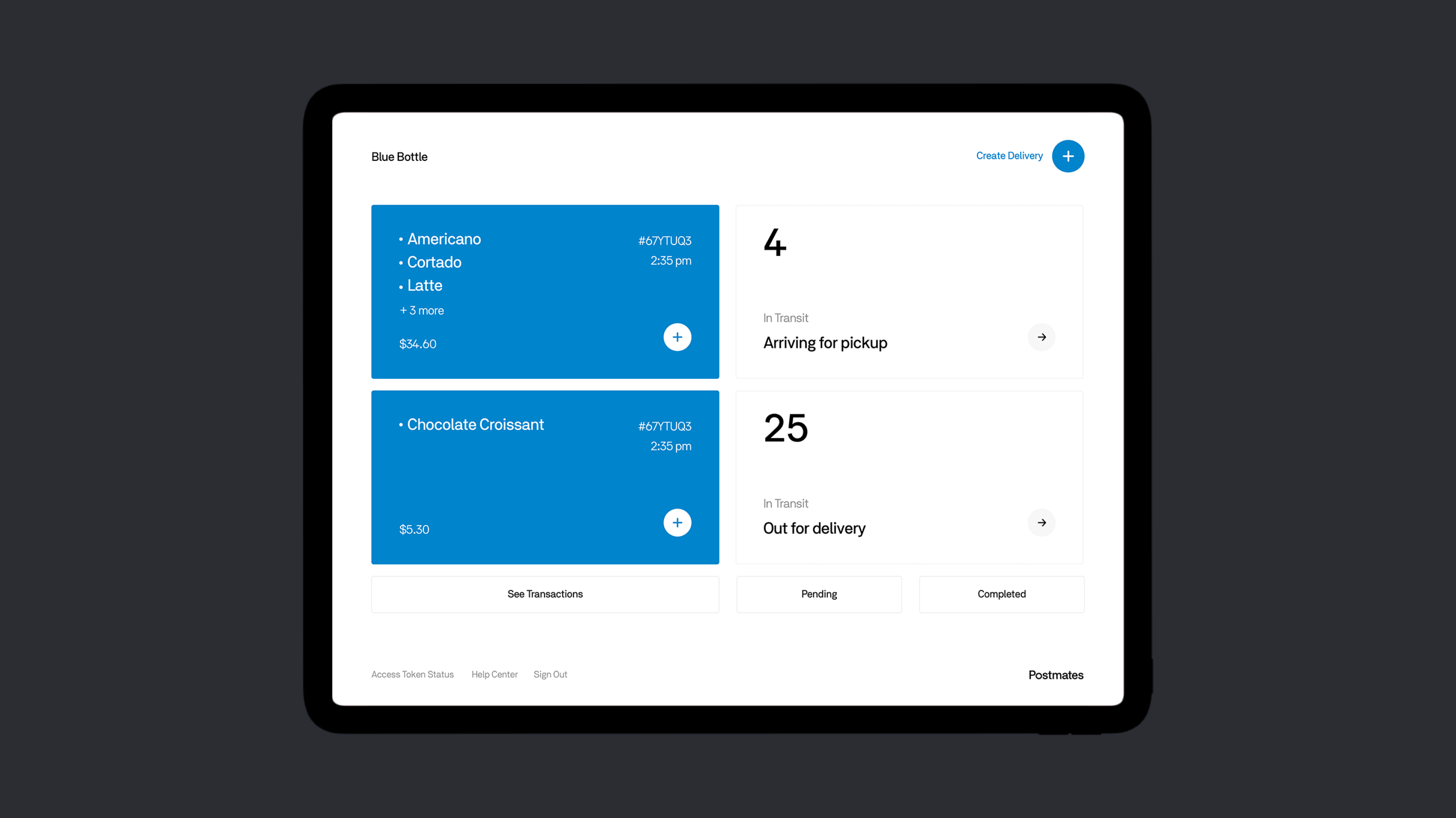
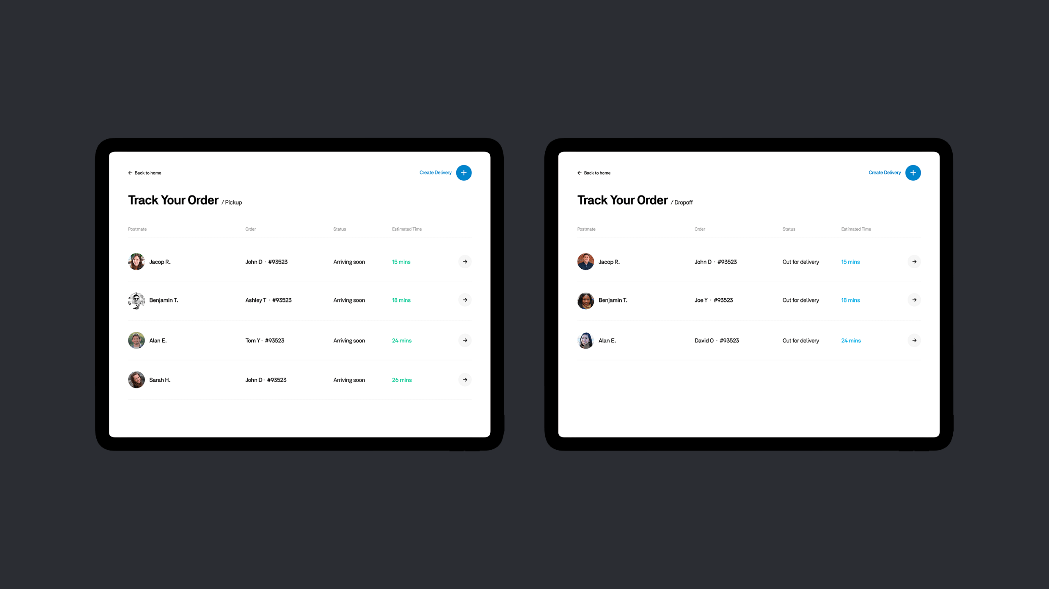
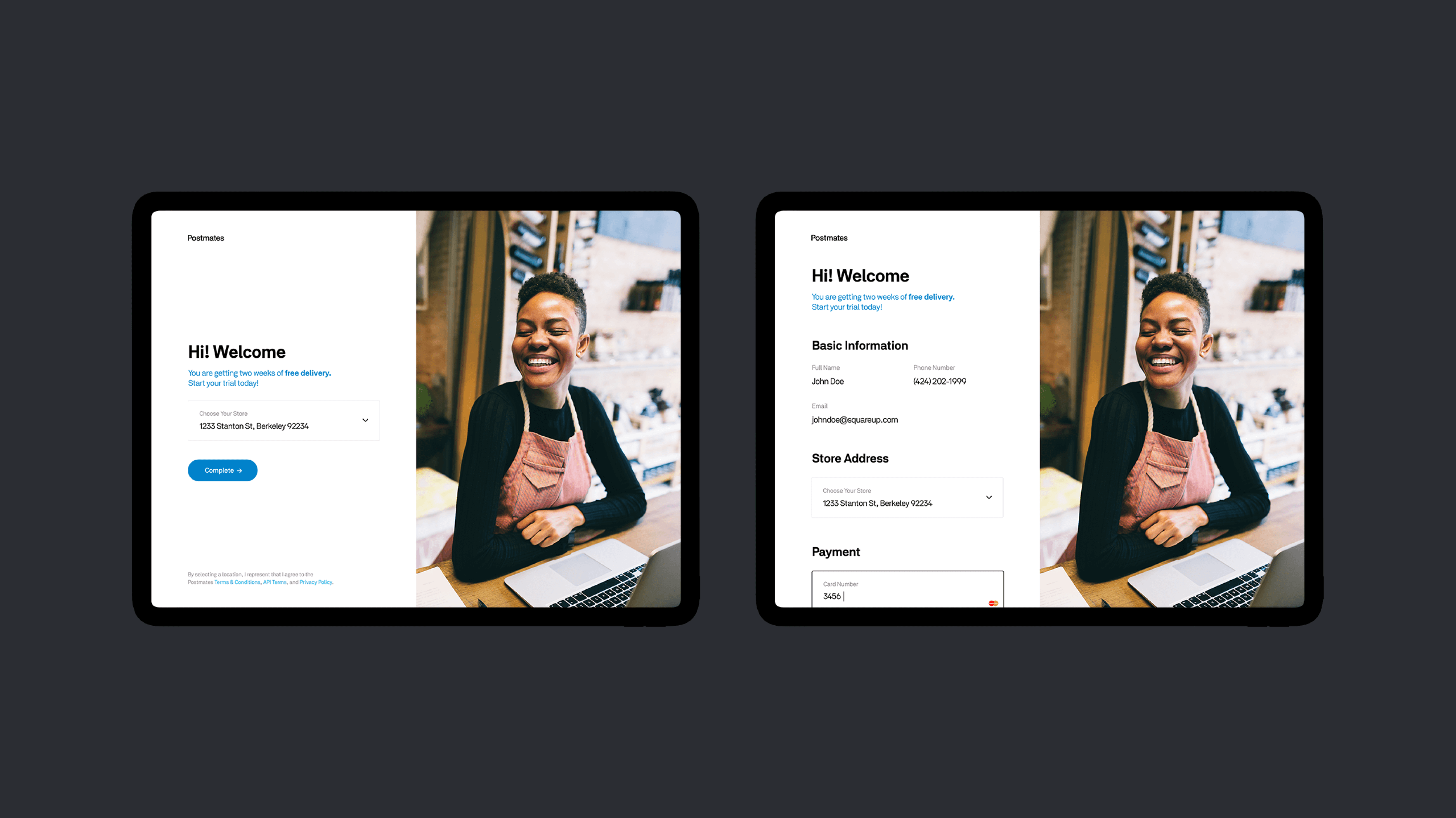
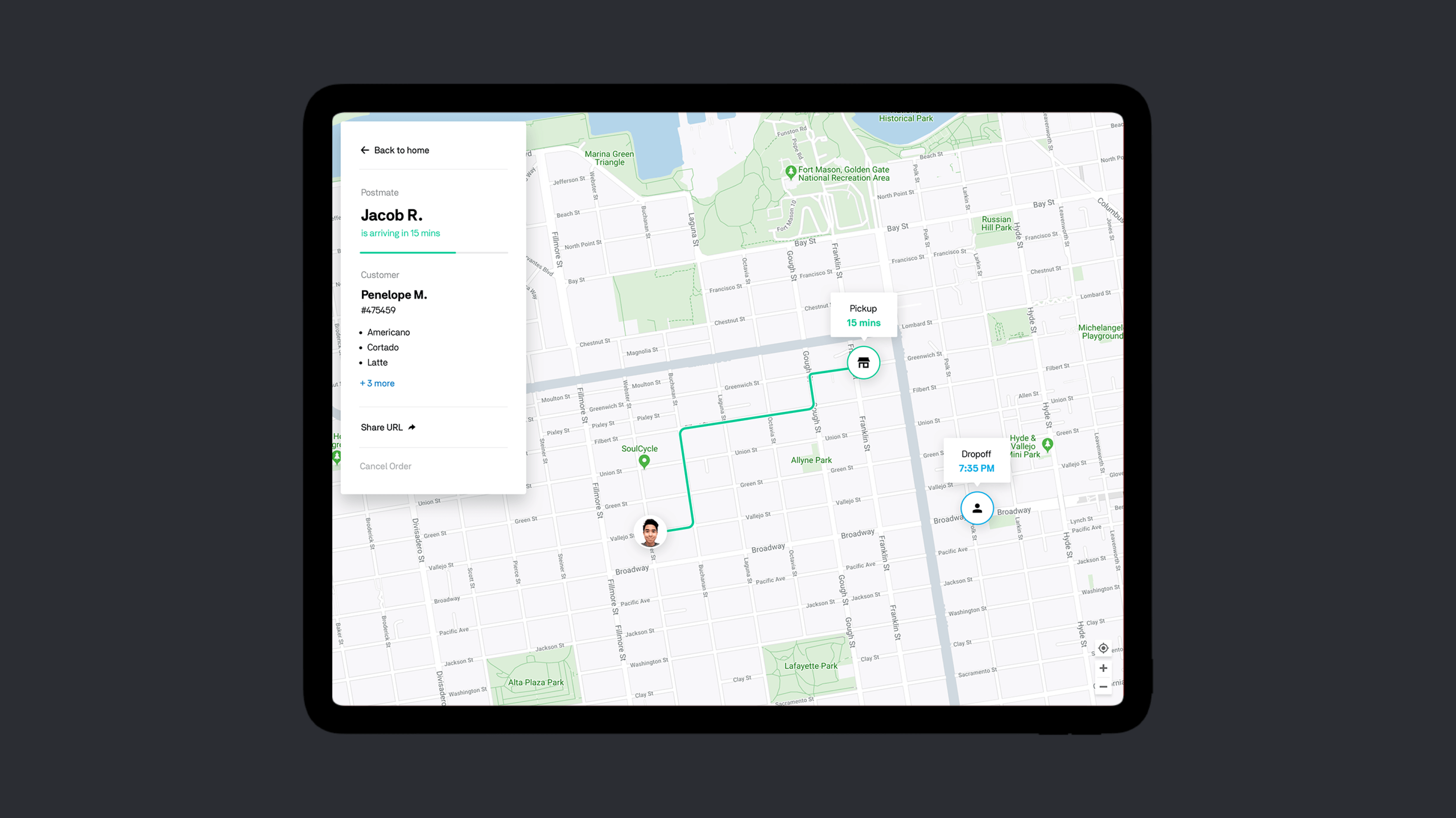
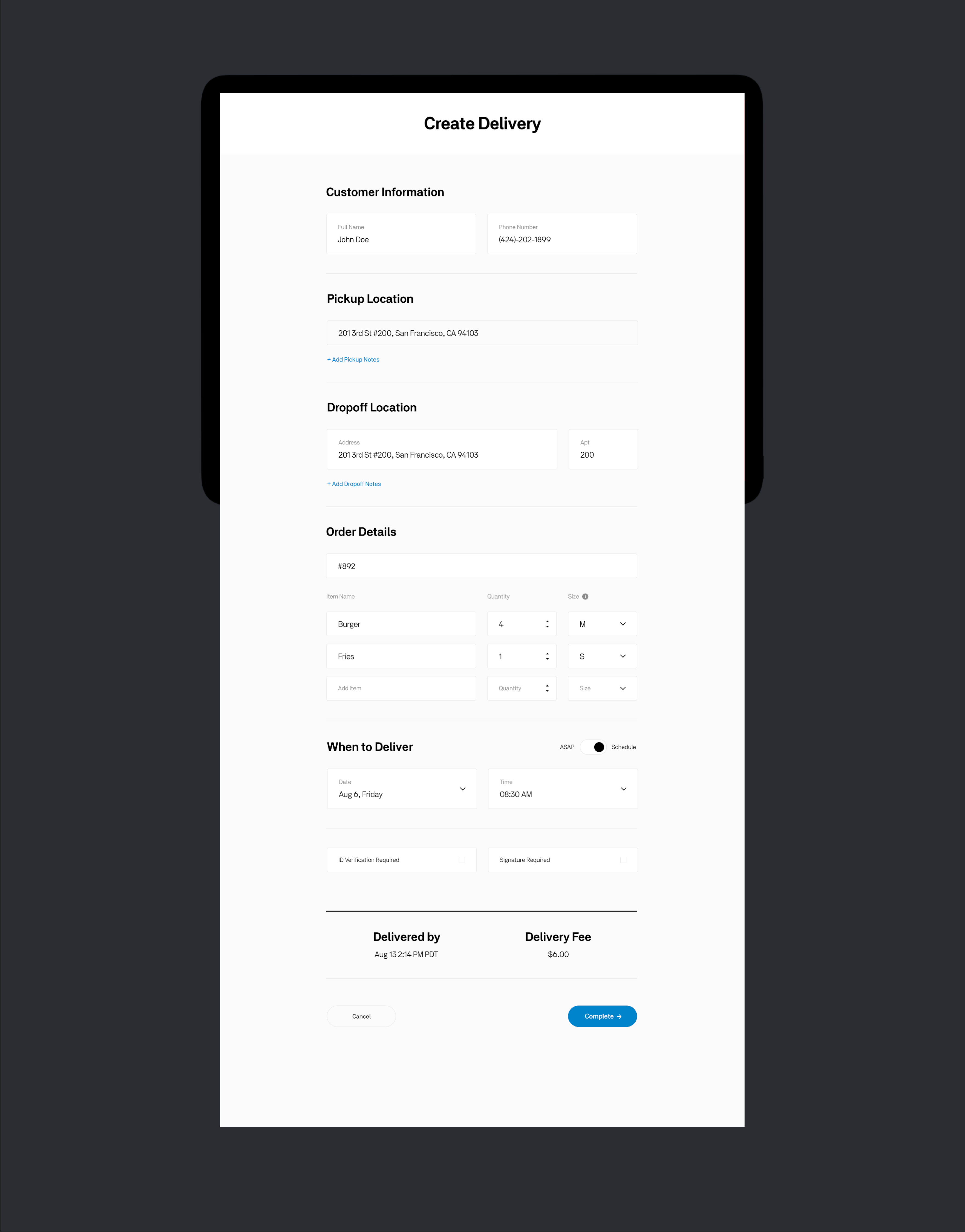
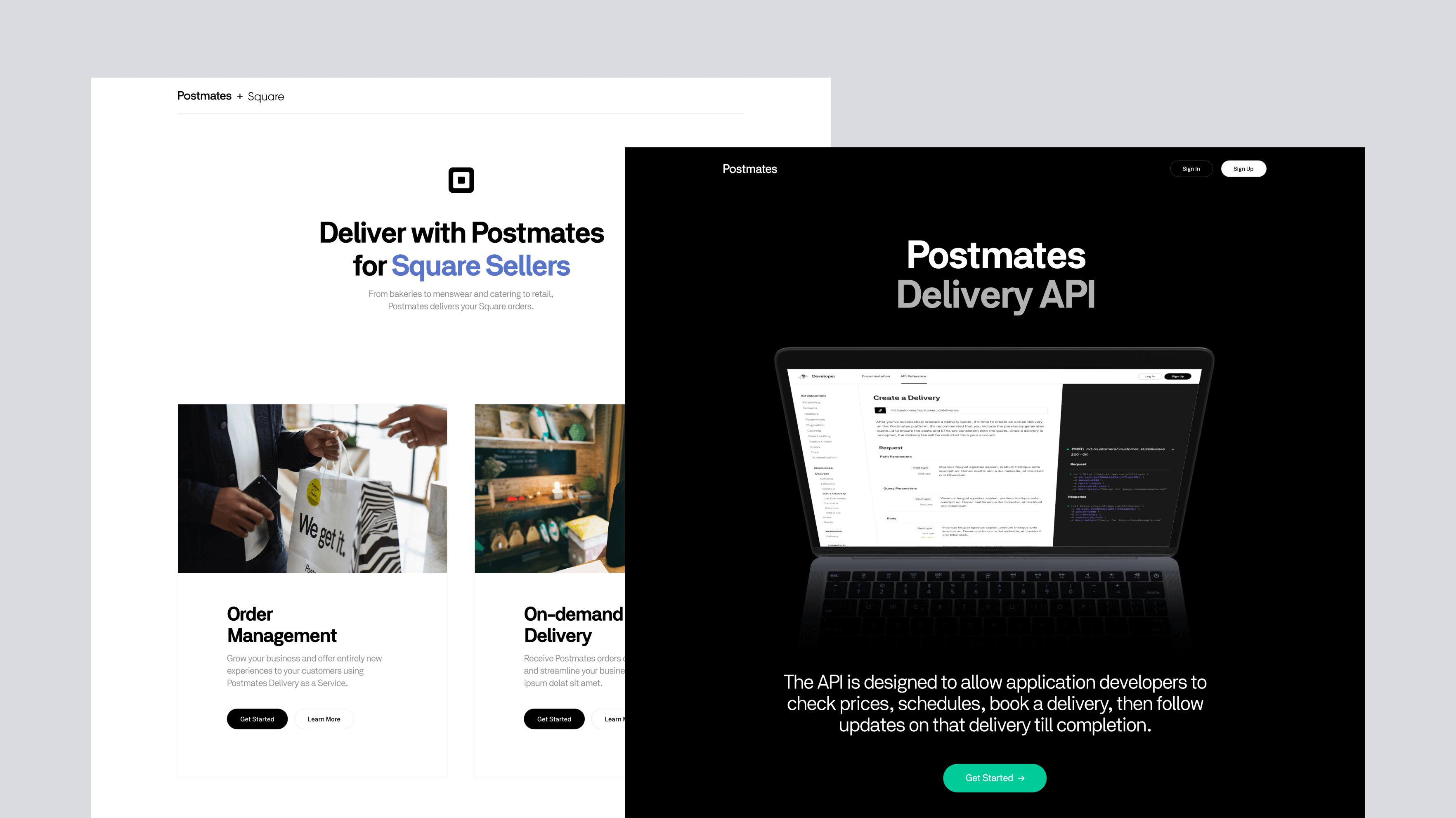
A fantastic idea offers merchants the ability to accept and fulfill delivery orders through native Square platforms for retail products, home goods, groceries, catering, food, and many more. I worked as a solo designer on this project and was responsible for the overall user experience and the look & feel from the beginning to the final execution. The goal was to allow users to create deliveries directly from Square transactions and get real-time tracking information with immediate or scheduled delivery options.
- Design Lead
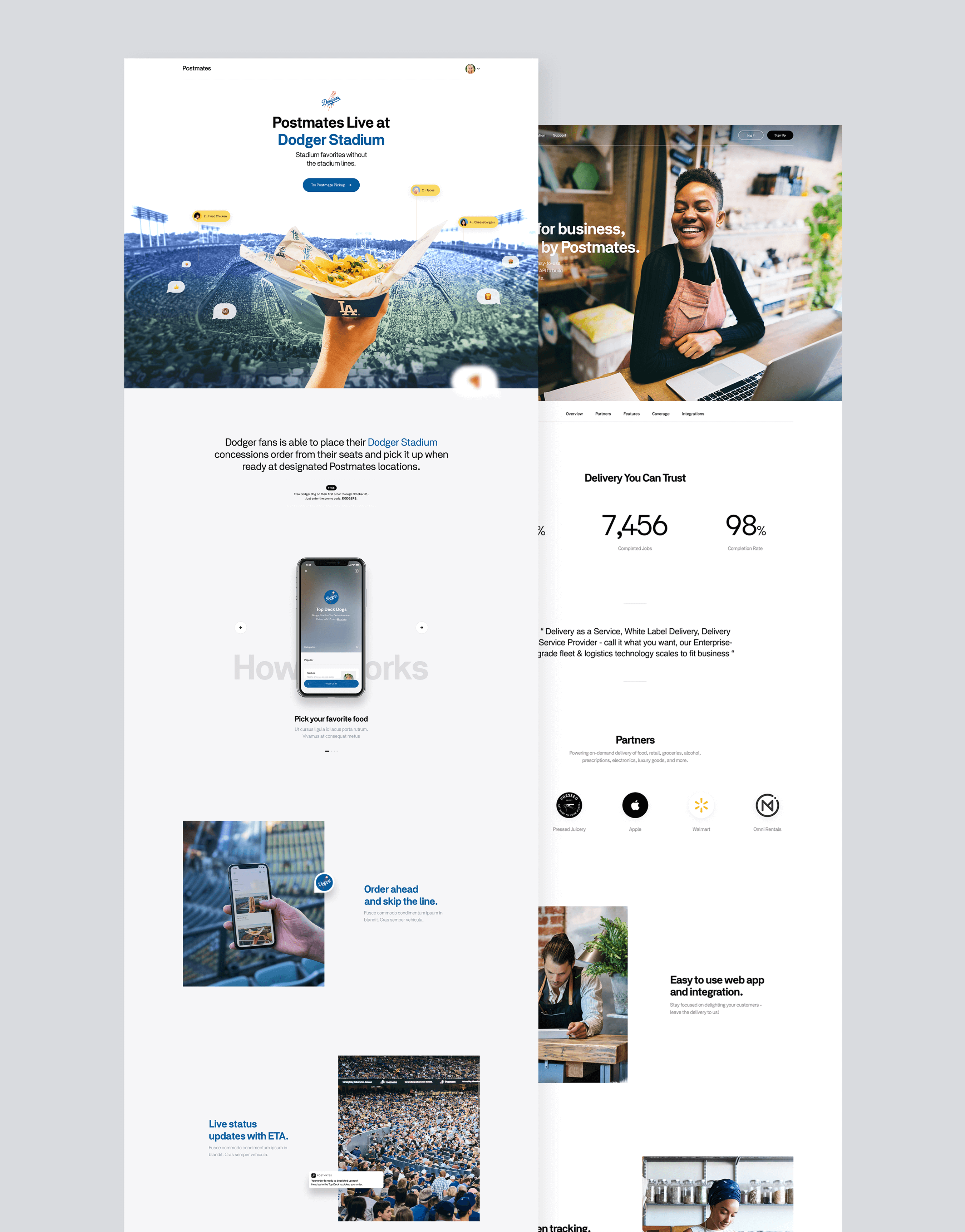
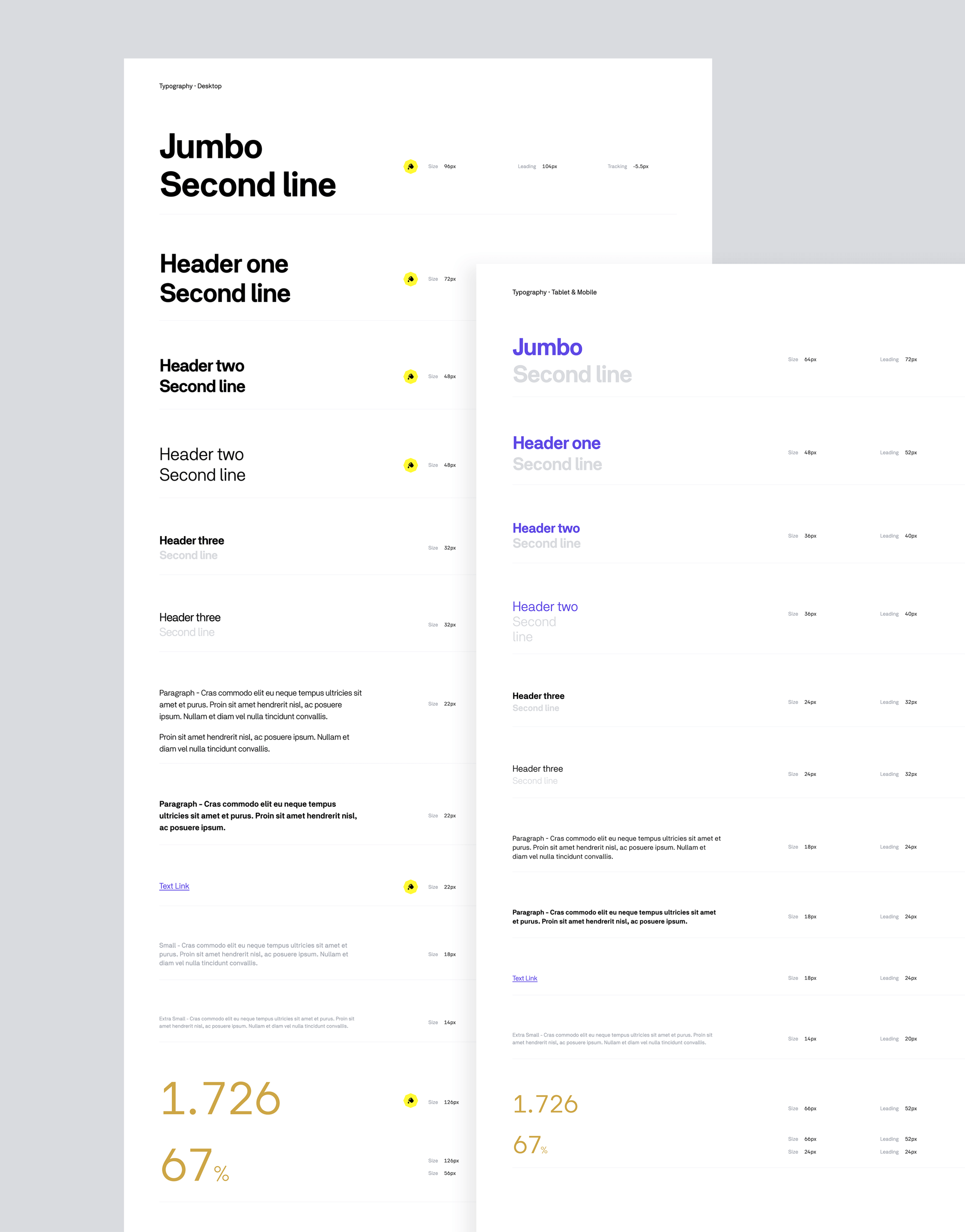
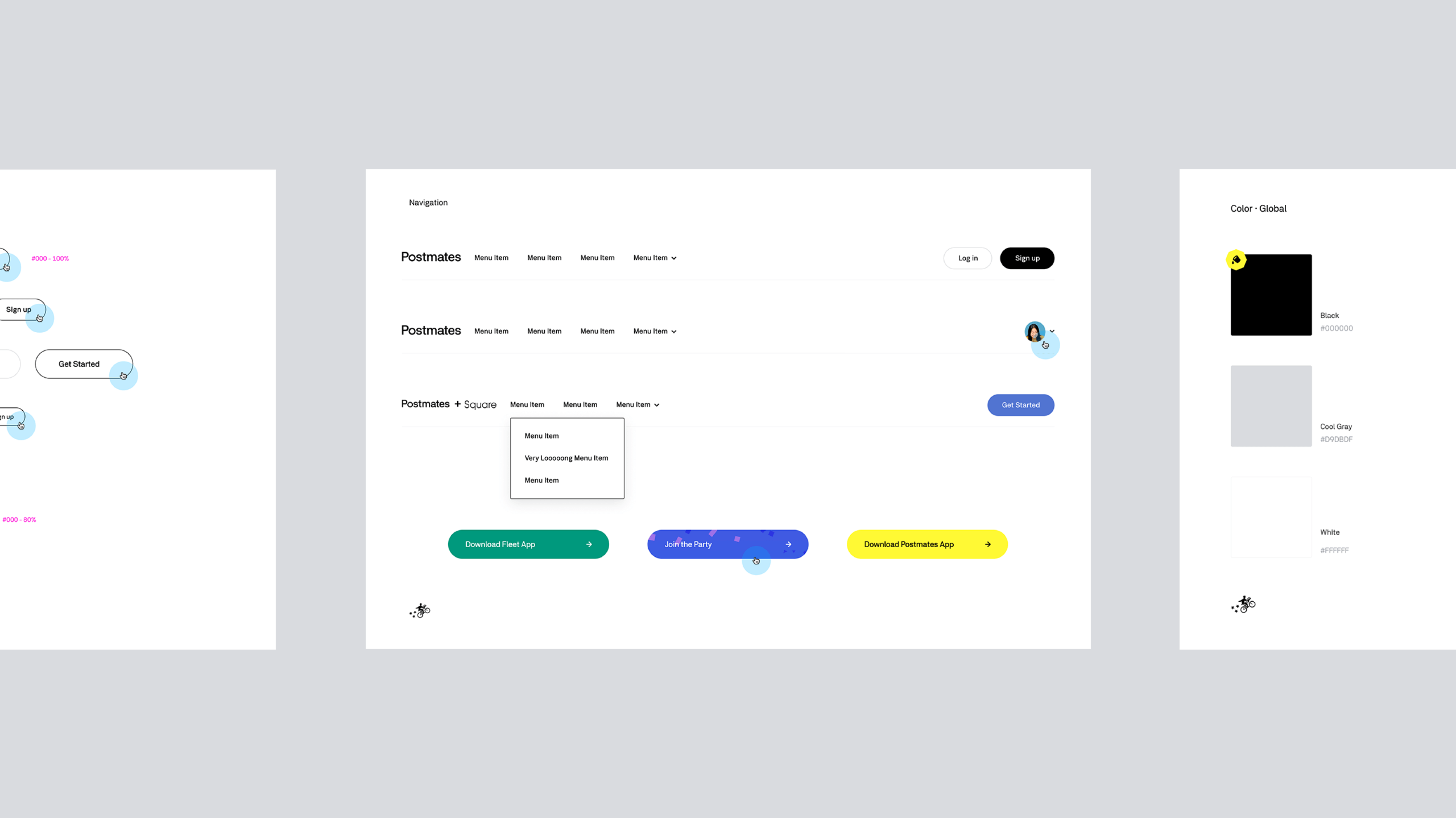
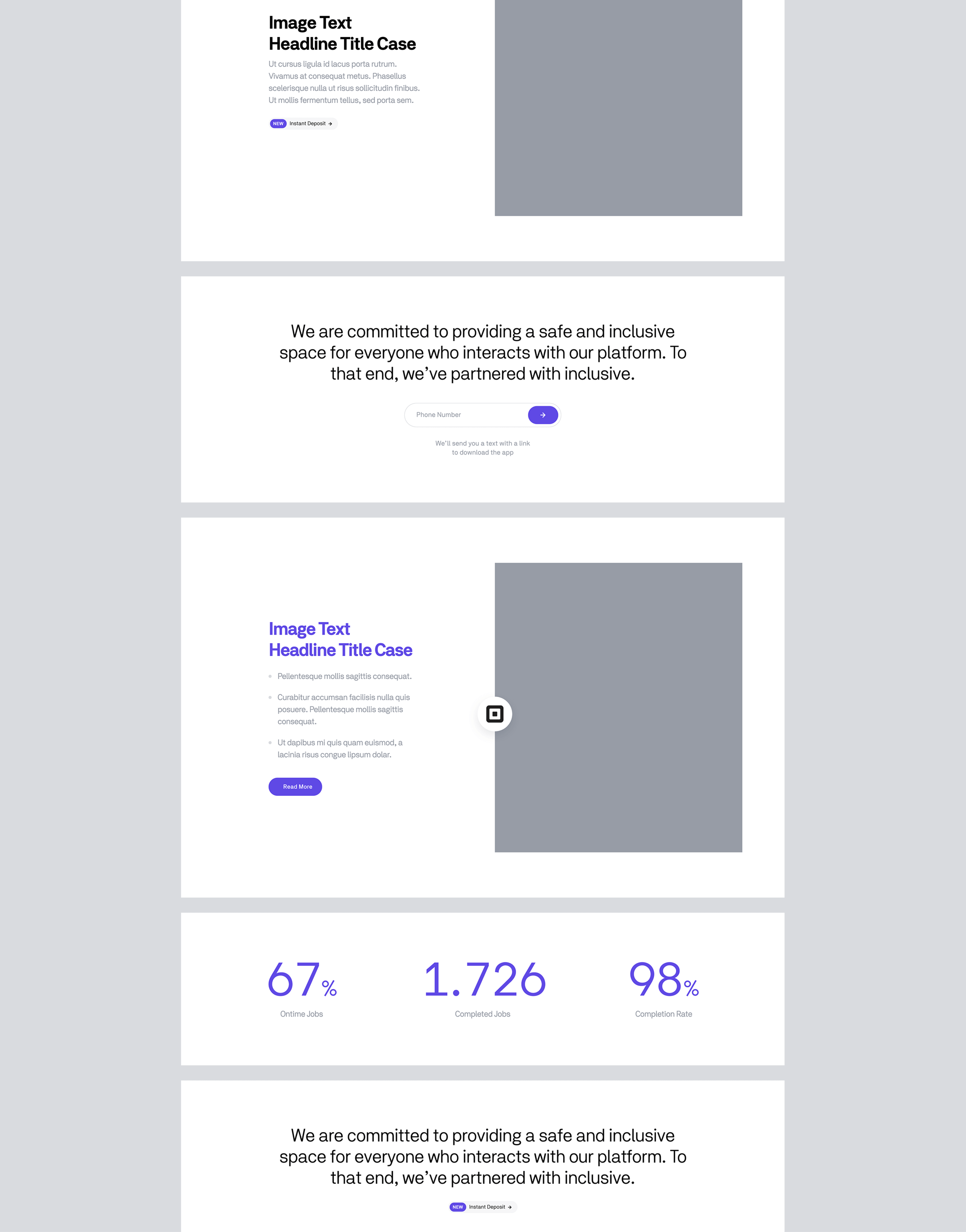
Postmates Design System
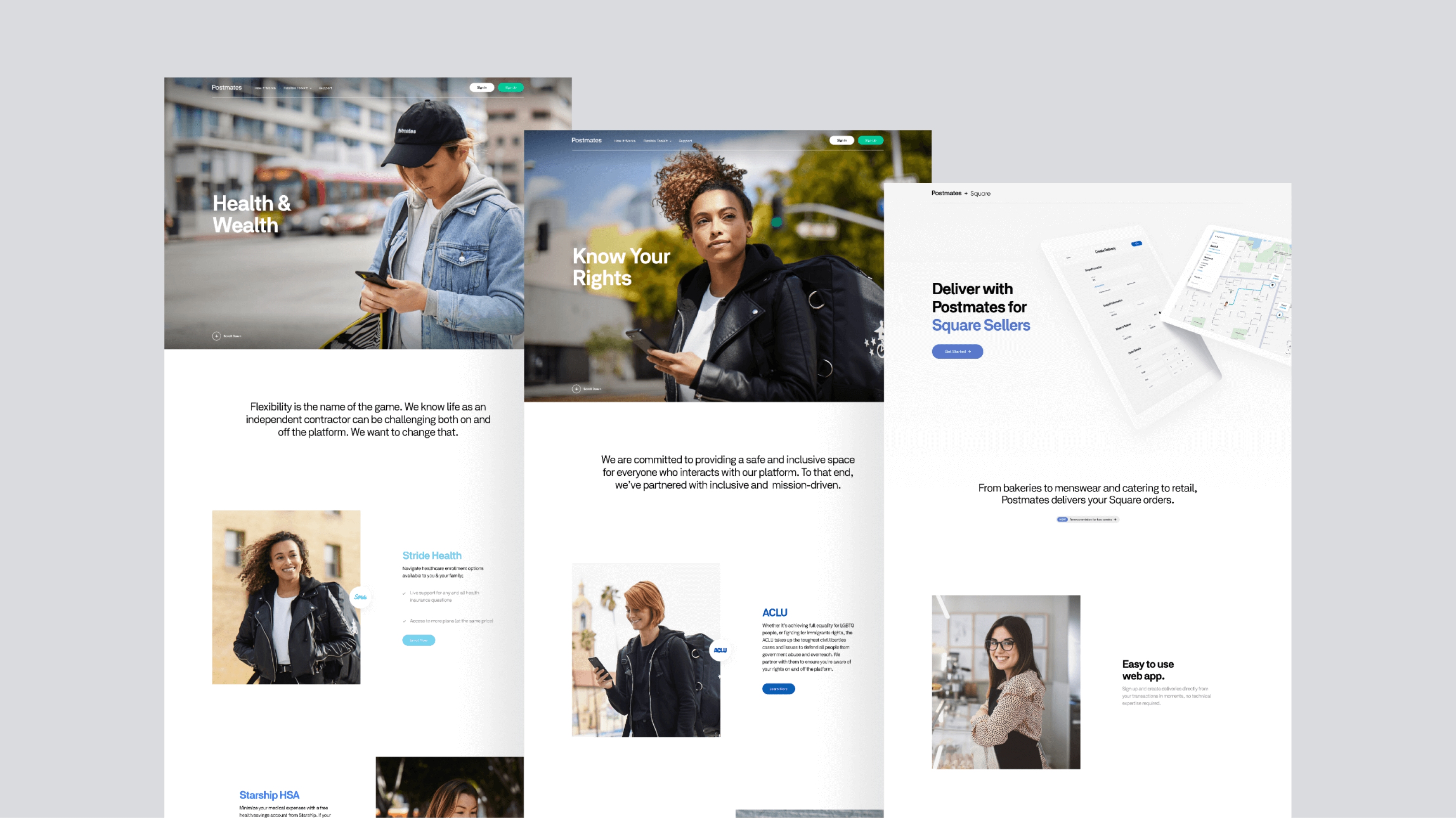
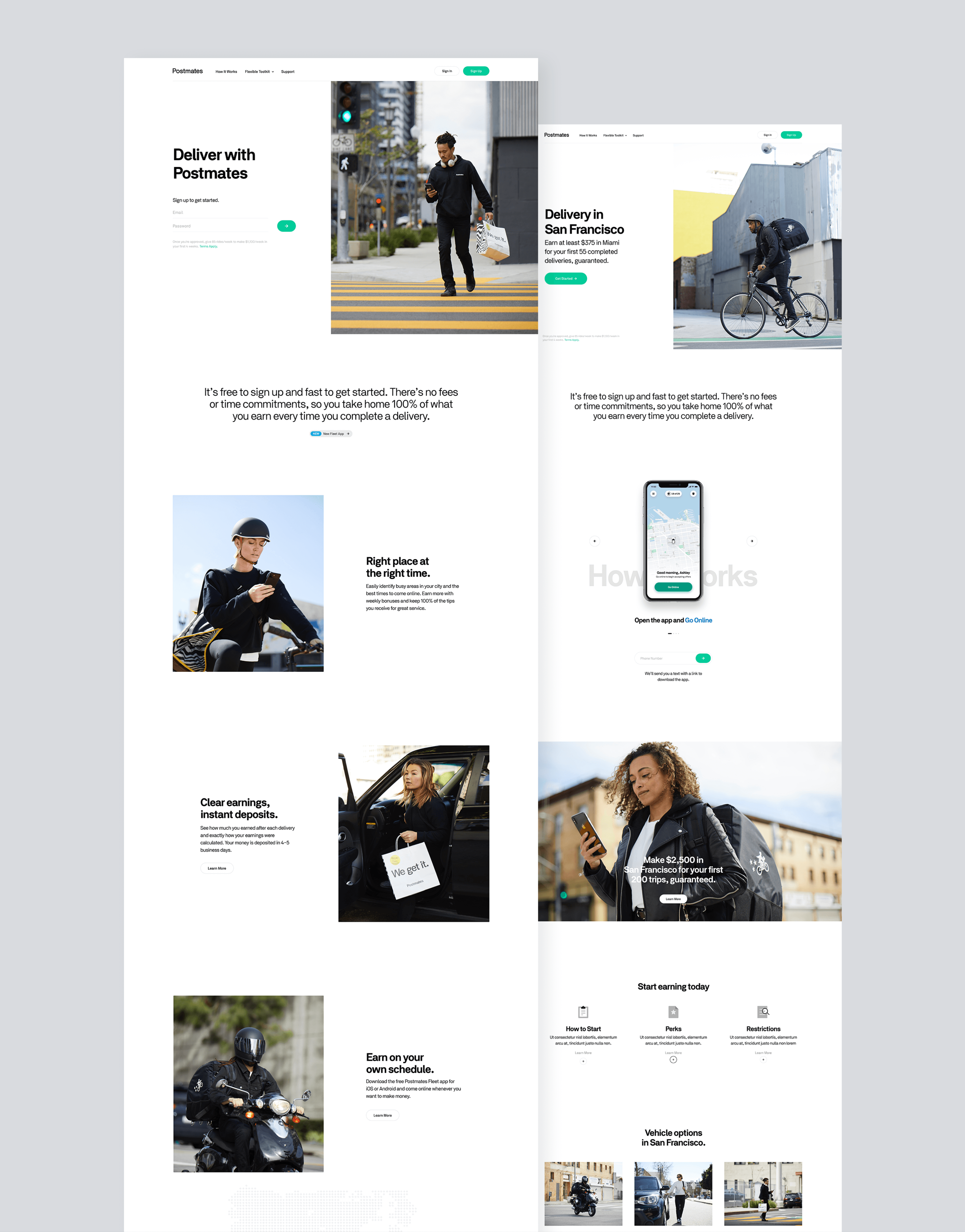
I led the design efforts of Postmates' web portion by creating an extensive design system to reflect Postmates' brand identity and make it scalable for the needs of different departments. This visual system called A to B led us to quickly curate many websites and maintain them effortlessly. It took several months to establish all the components with a significant engineering effort.
- Creative Director & Designer
Facebook Awards
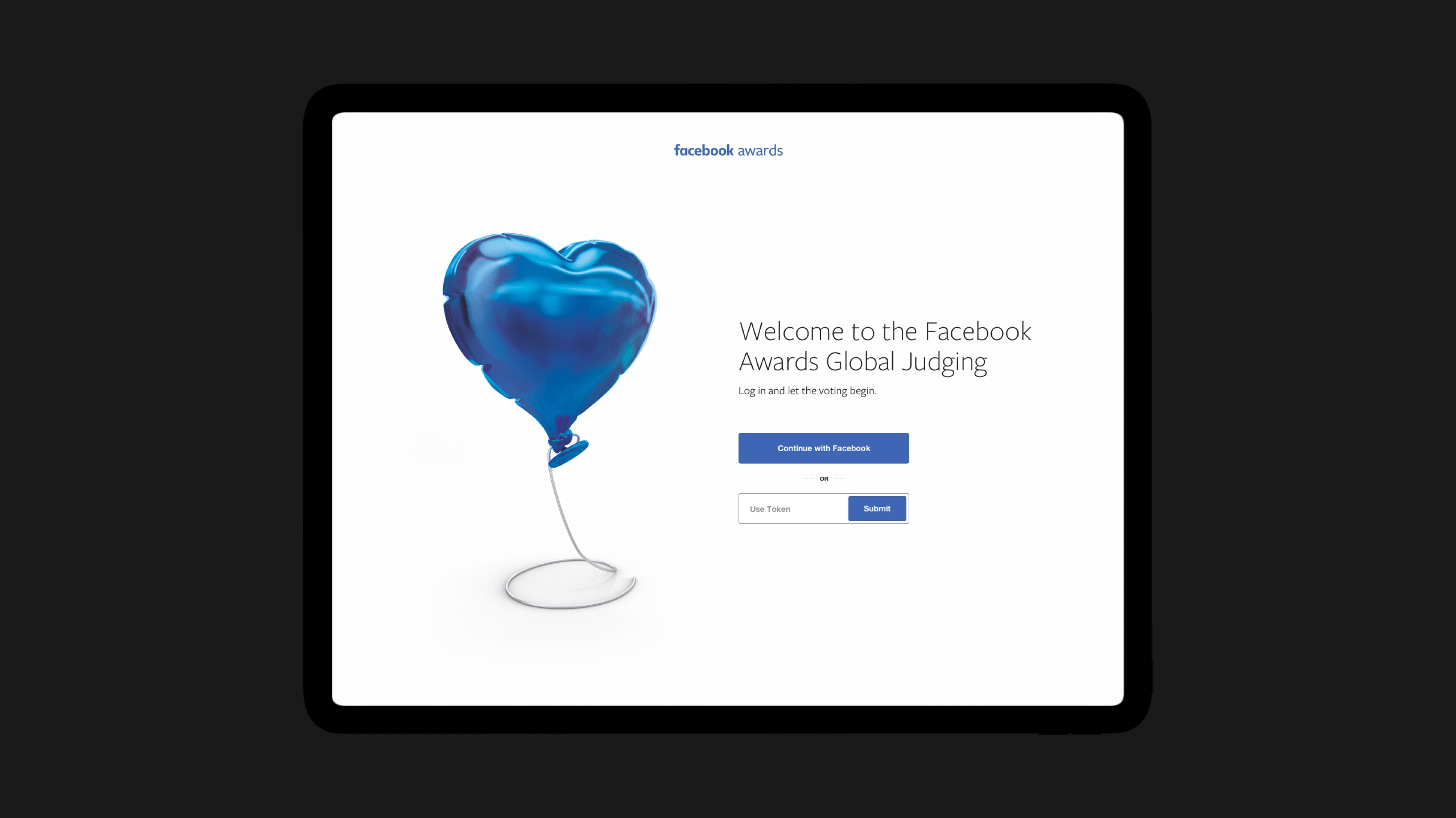
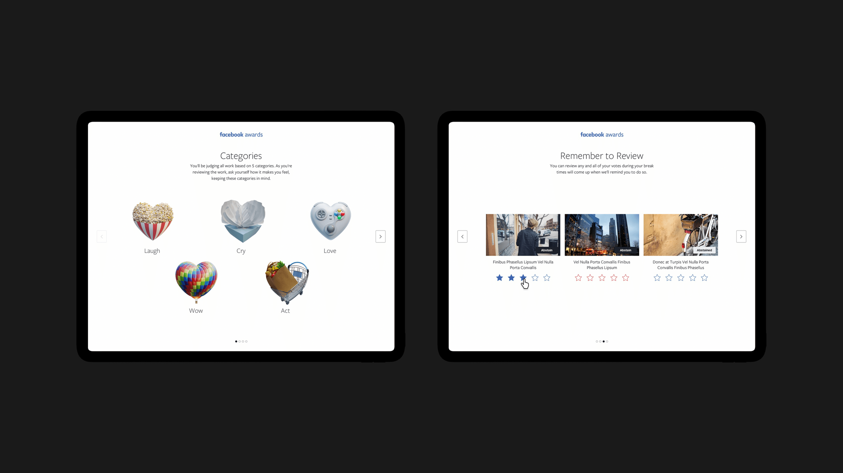
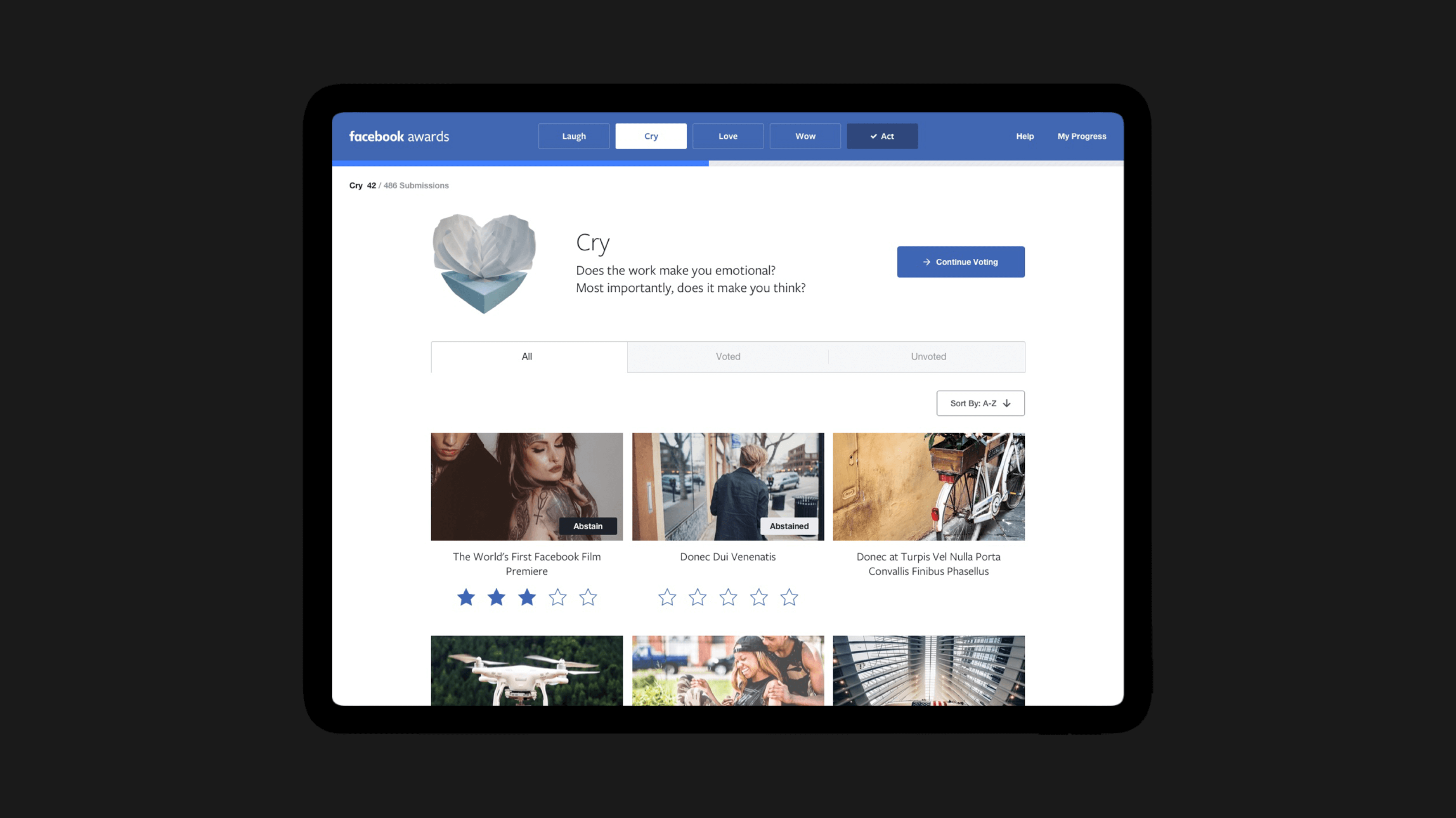
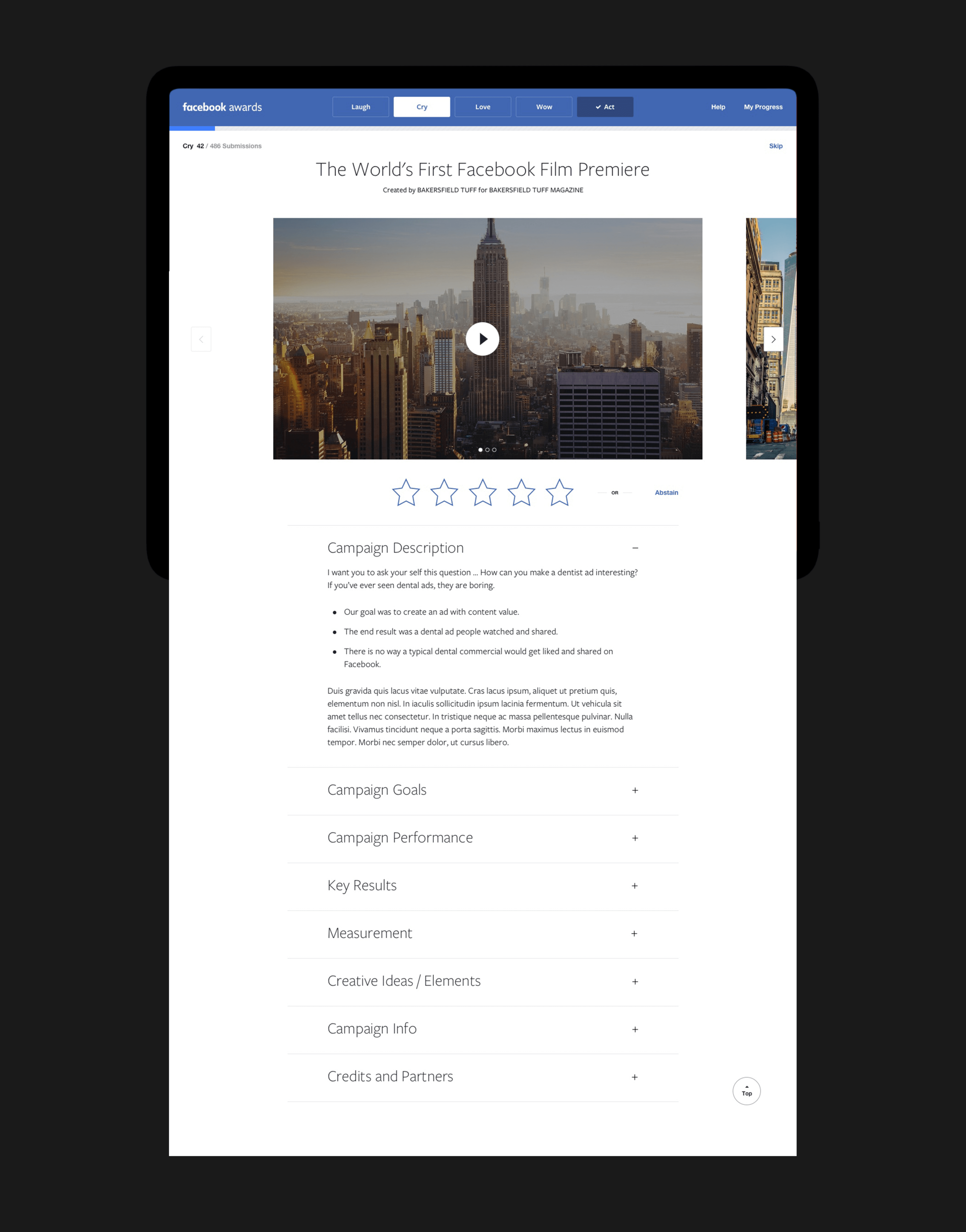
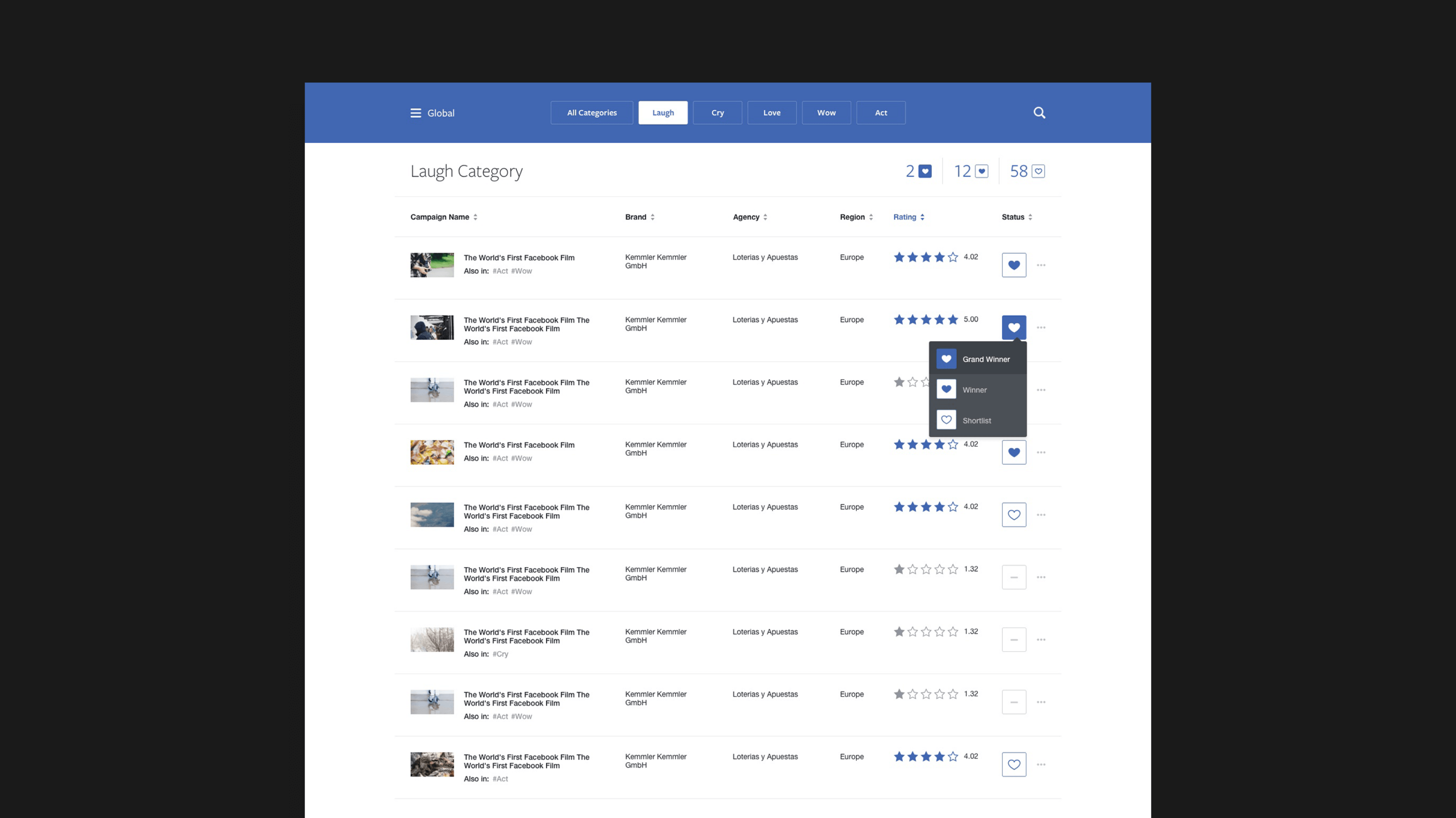
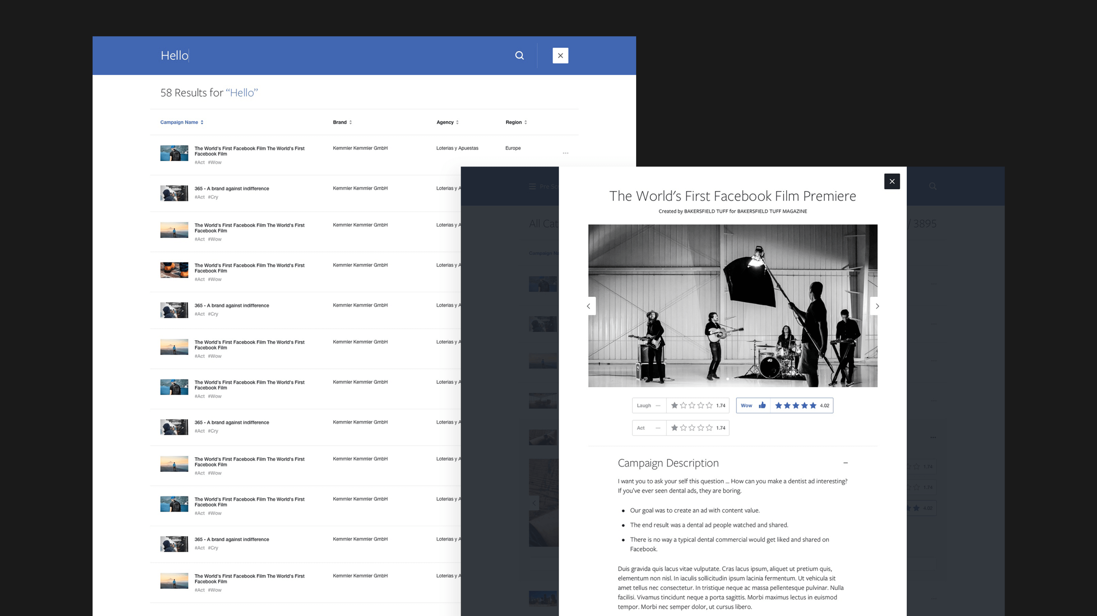
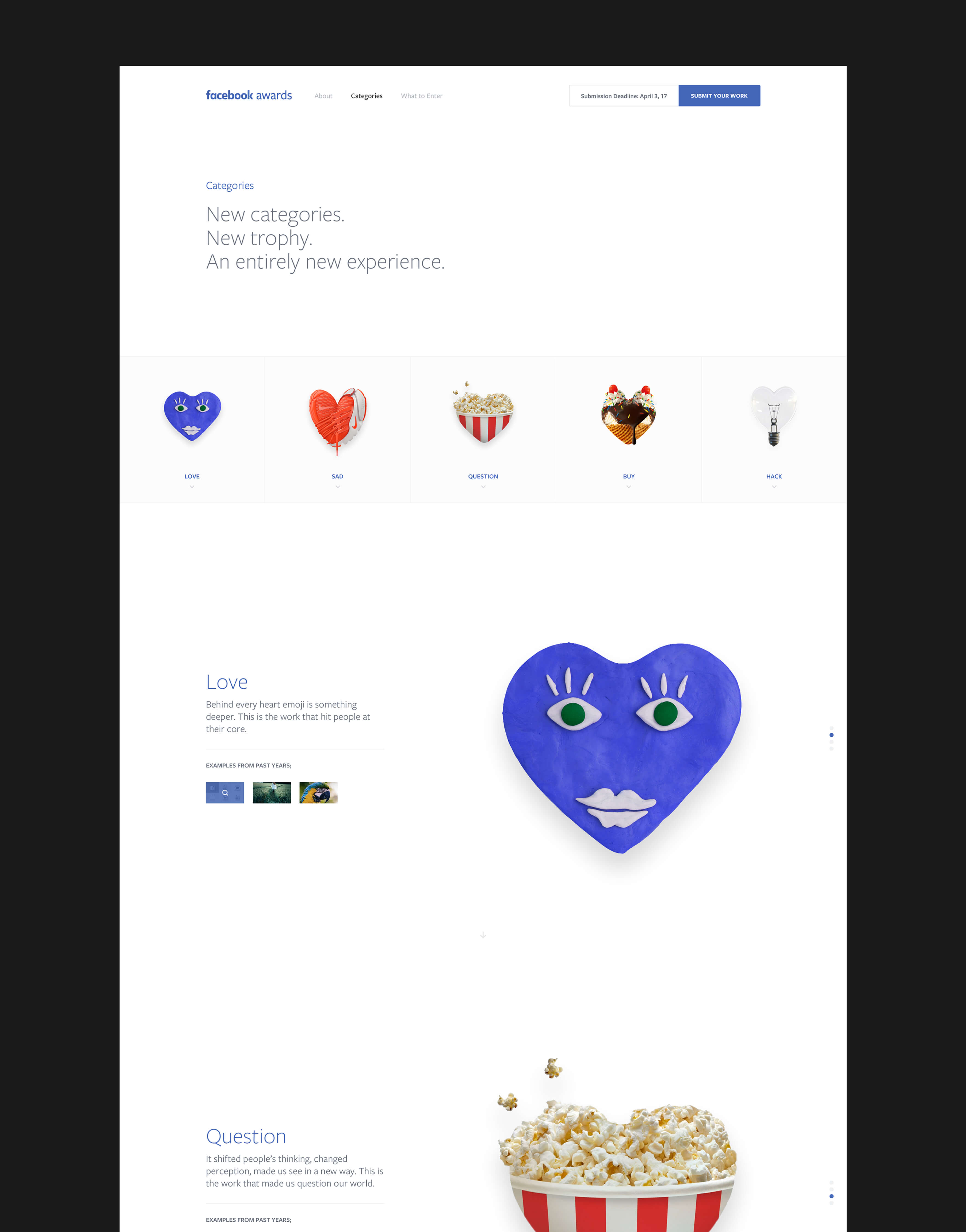
The Facebook Awards celebrate the agencies and marketers pushing the boundaries of creativity and showing the world what can be achieved on this new, connected canvas. I worked as a design lead for the marketing website and the dashboard used by judges worldwide. The judging dashboard was designed to accommodate the different stages of judging for thousands of submissions quickly and simply. Every stage presents the essential content in a meaningful hierarchy to help judges see what they need.
- Design Lead
